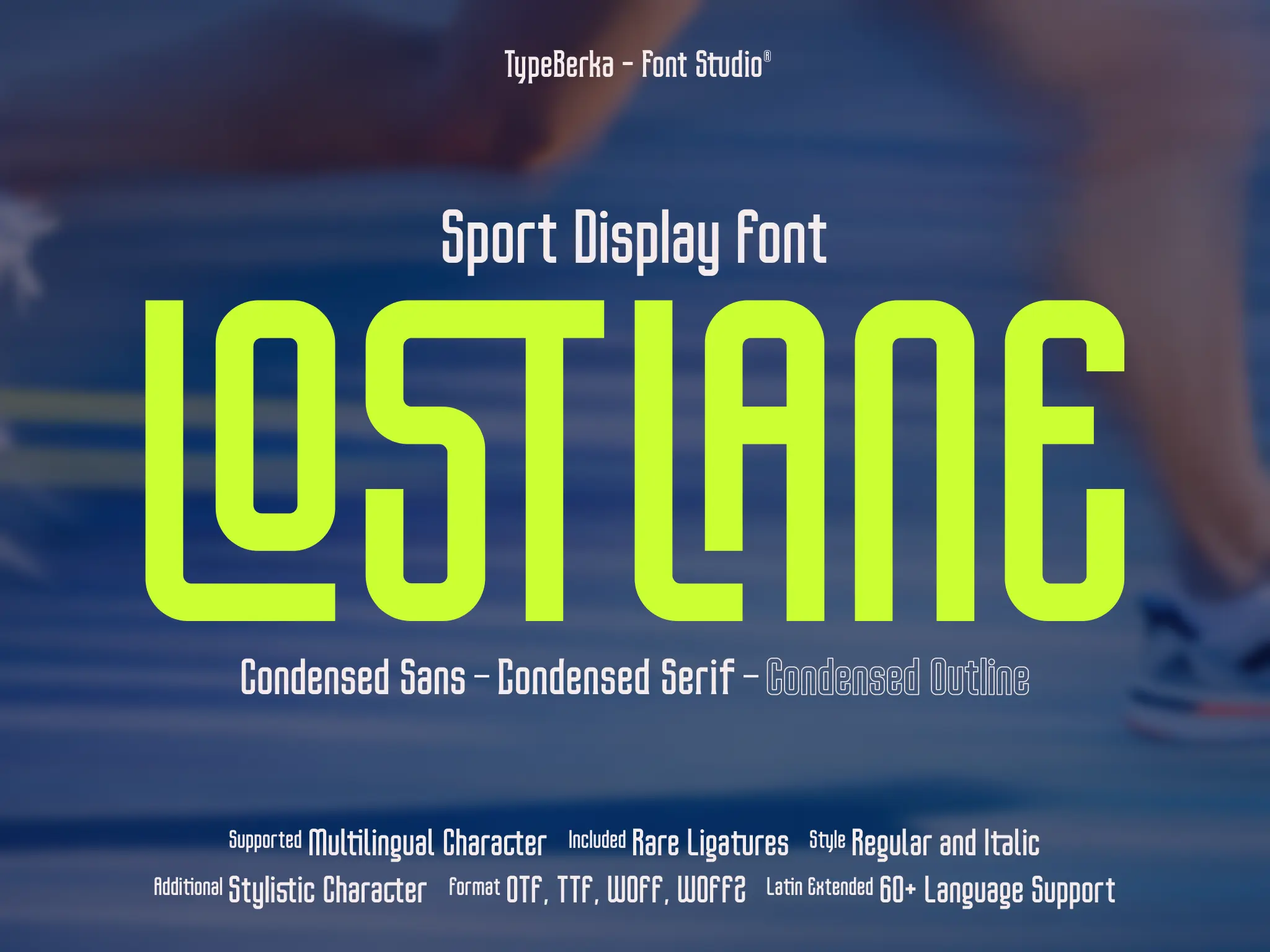
Lostlane
Lostlane is a condensed display font built for motorsport and telemetry-style typography. It keeps numbers and short labels readable in tight layouts.
Included Formats
TTF, OTF, WOFF, WOFF2
Version
Lifetime updates included. You'll be notified when a new version is available.
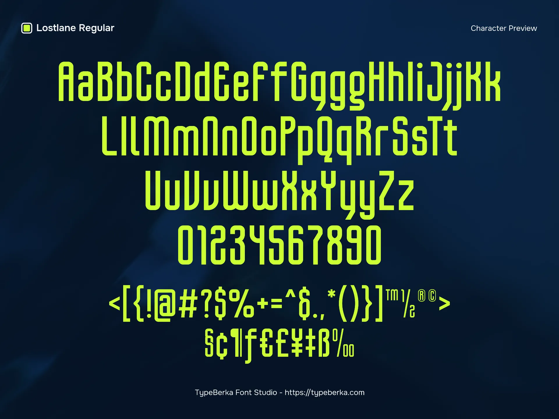
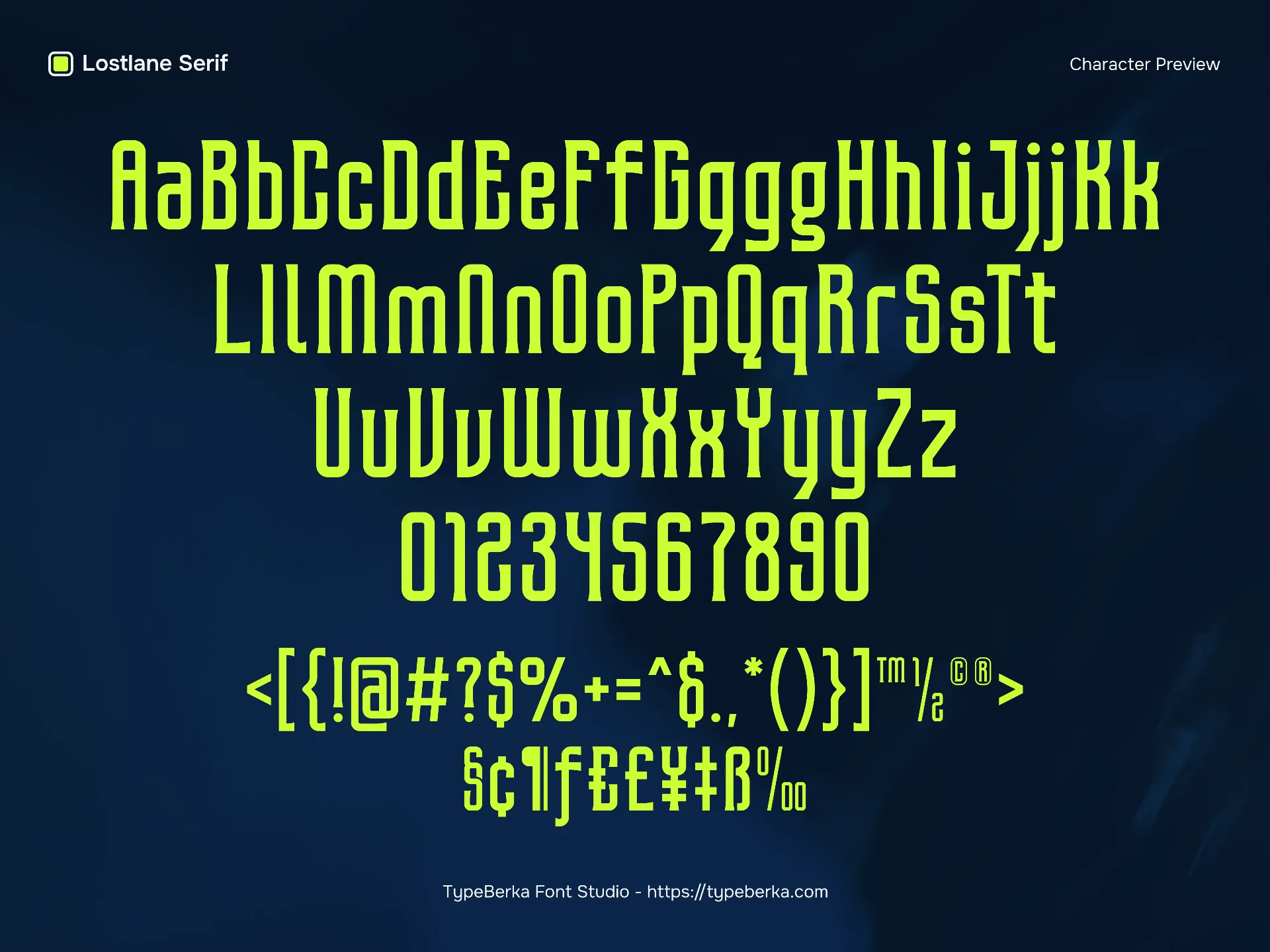
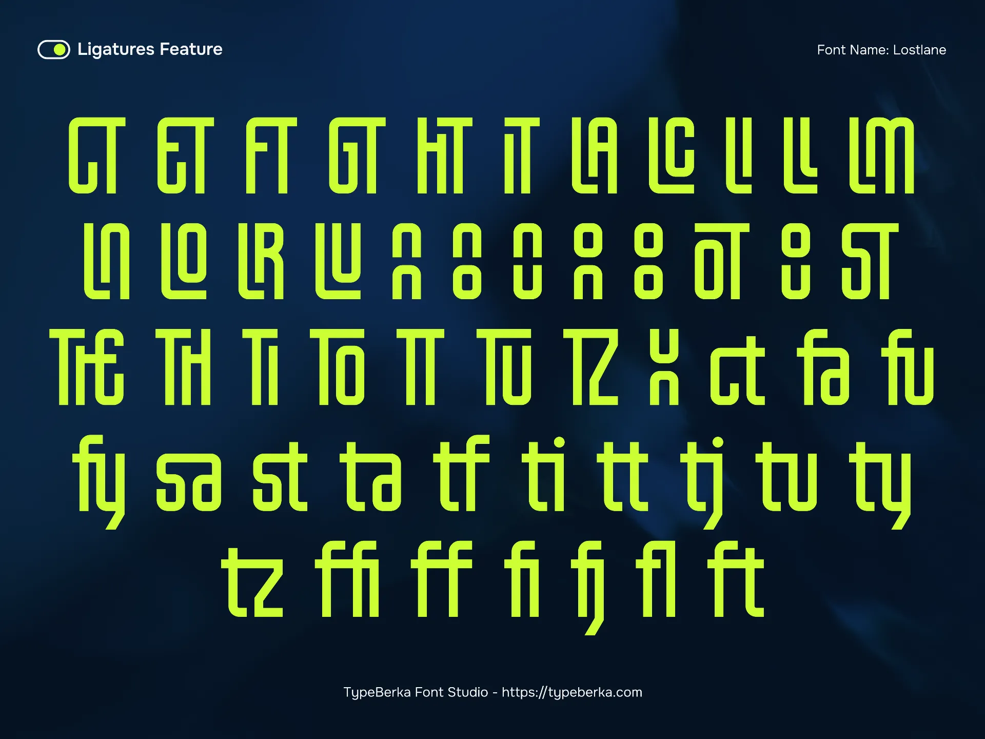
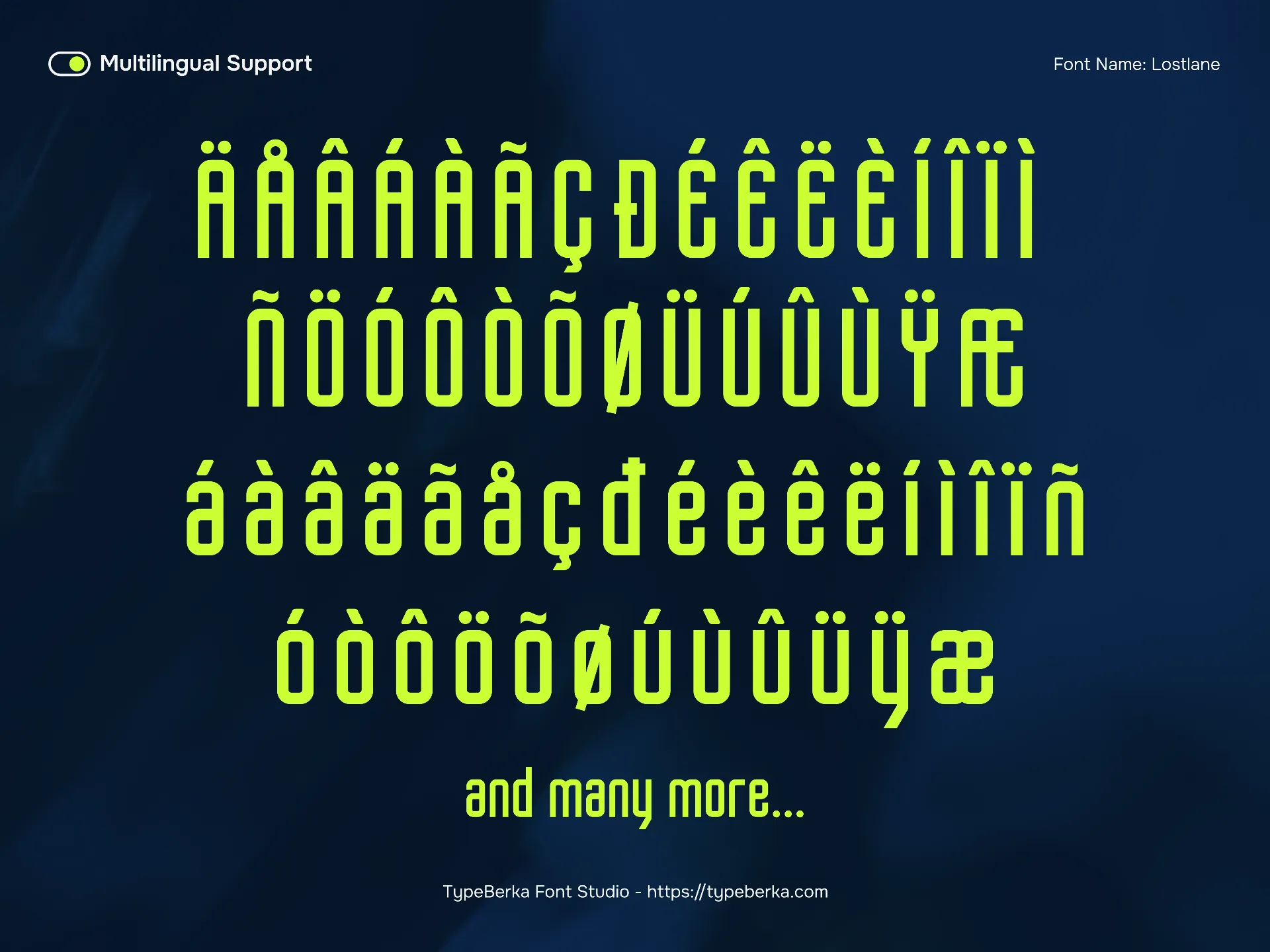
Font Features
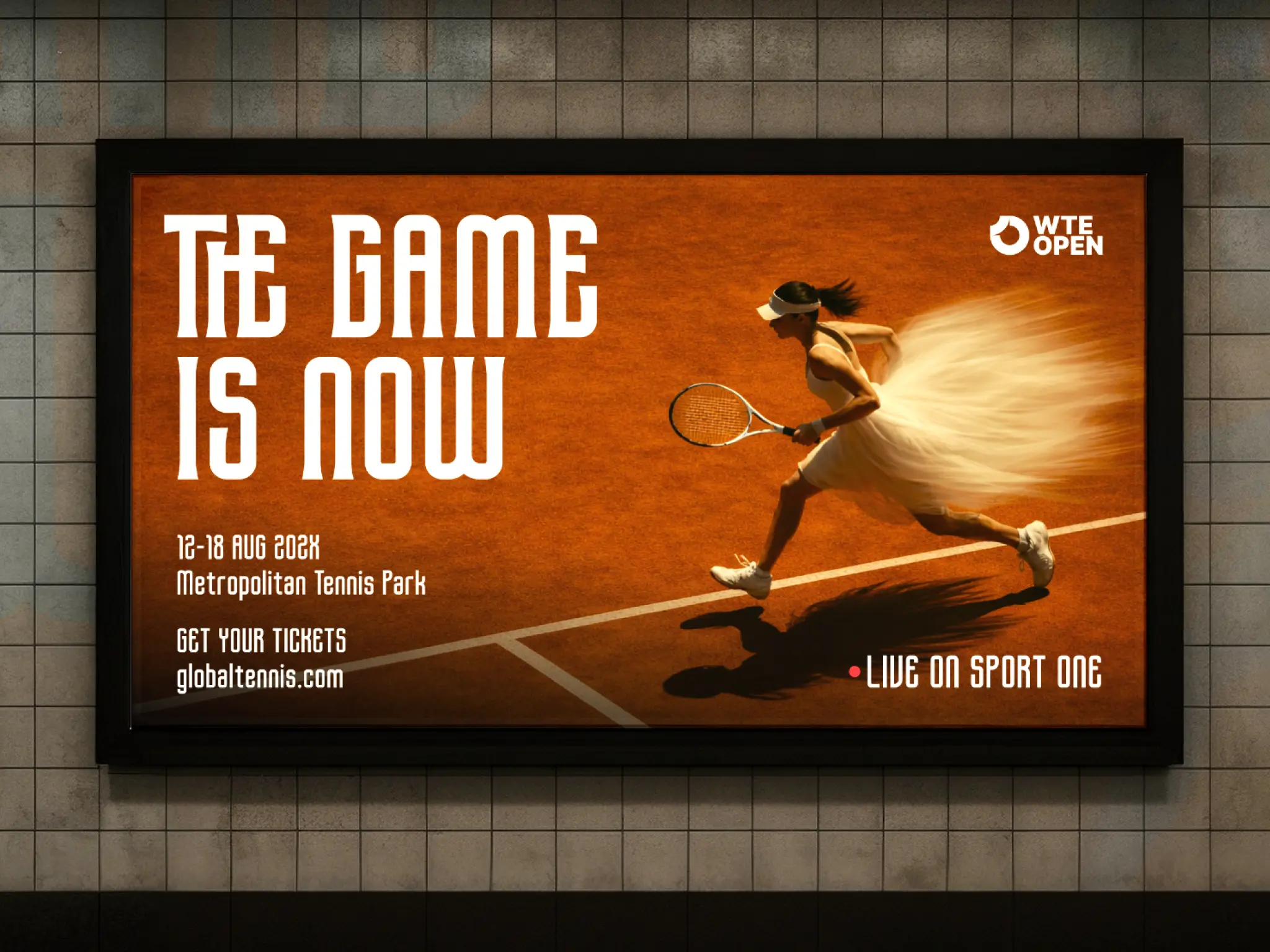
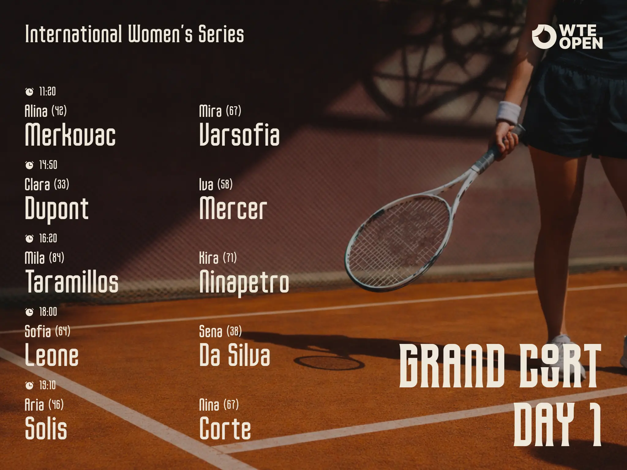
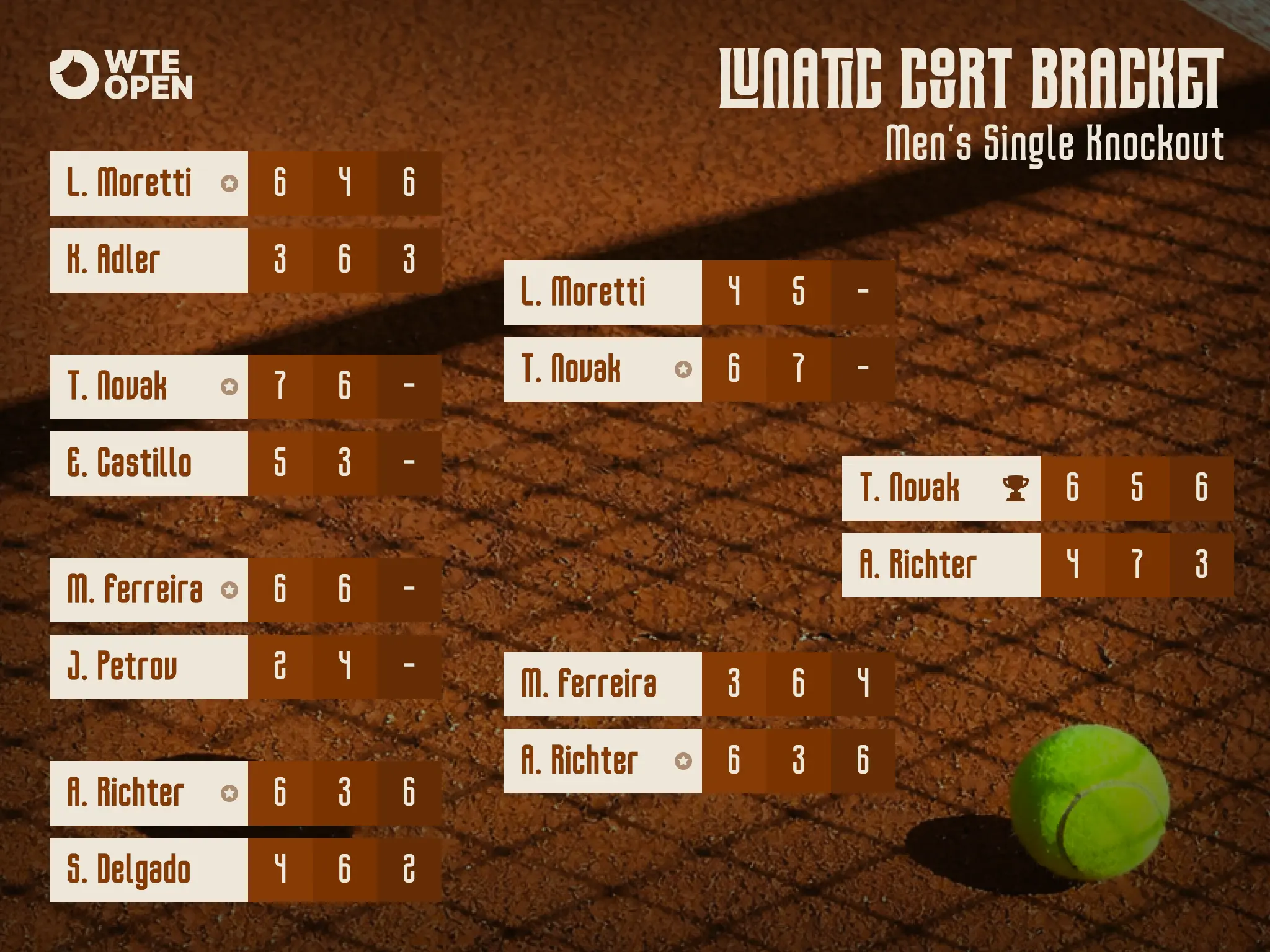
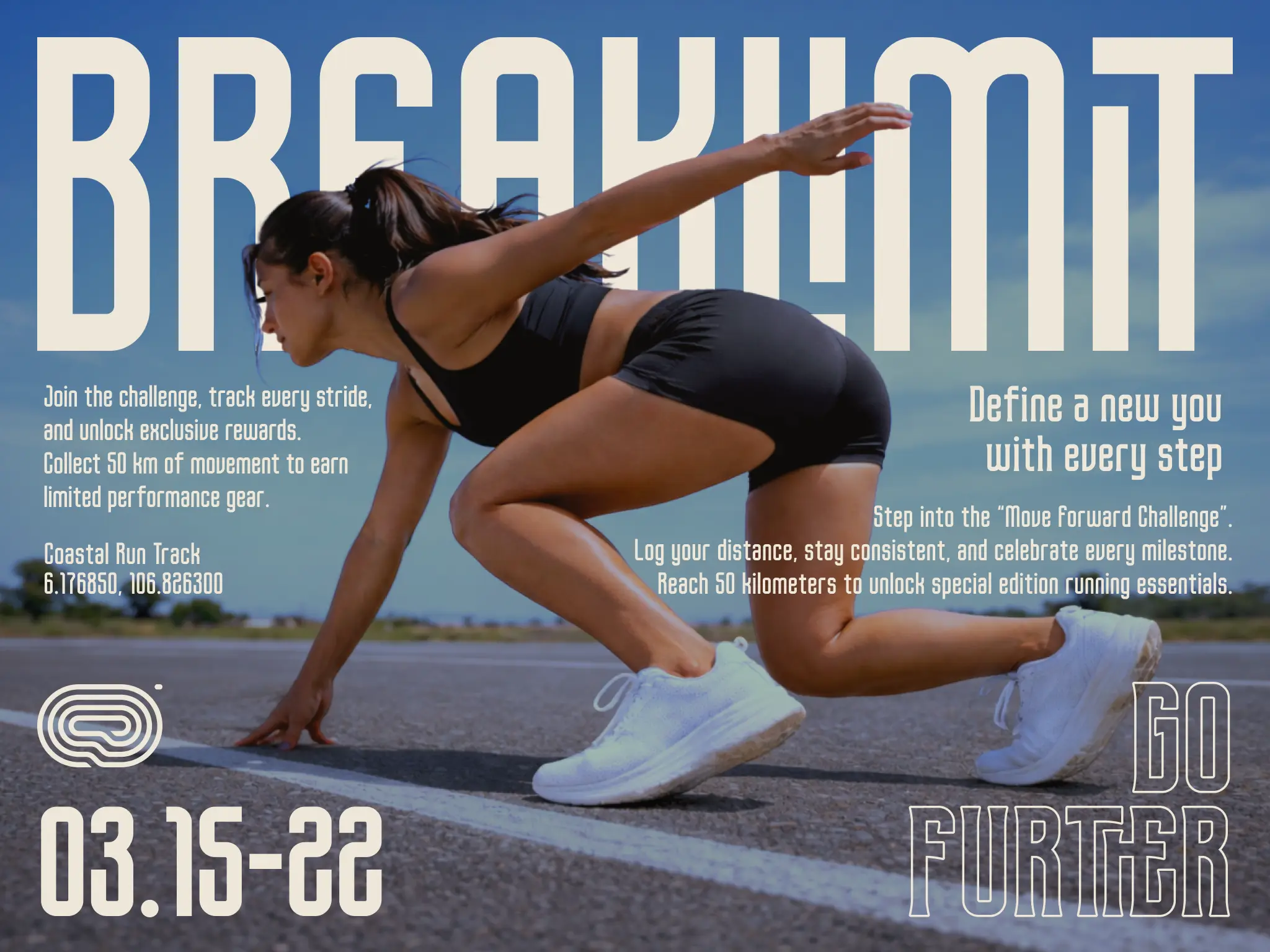
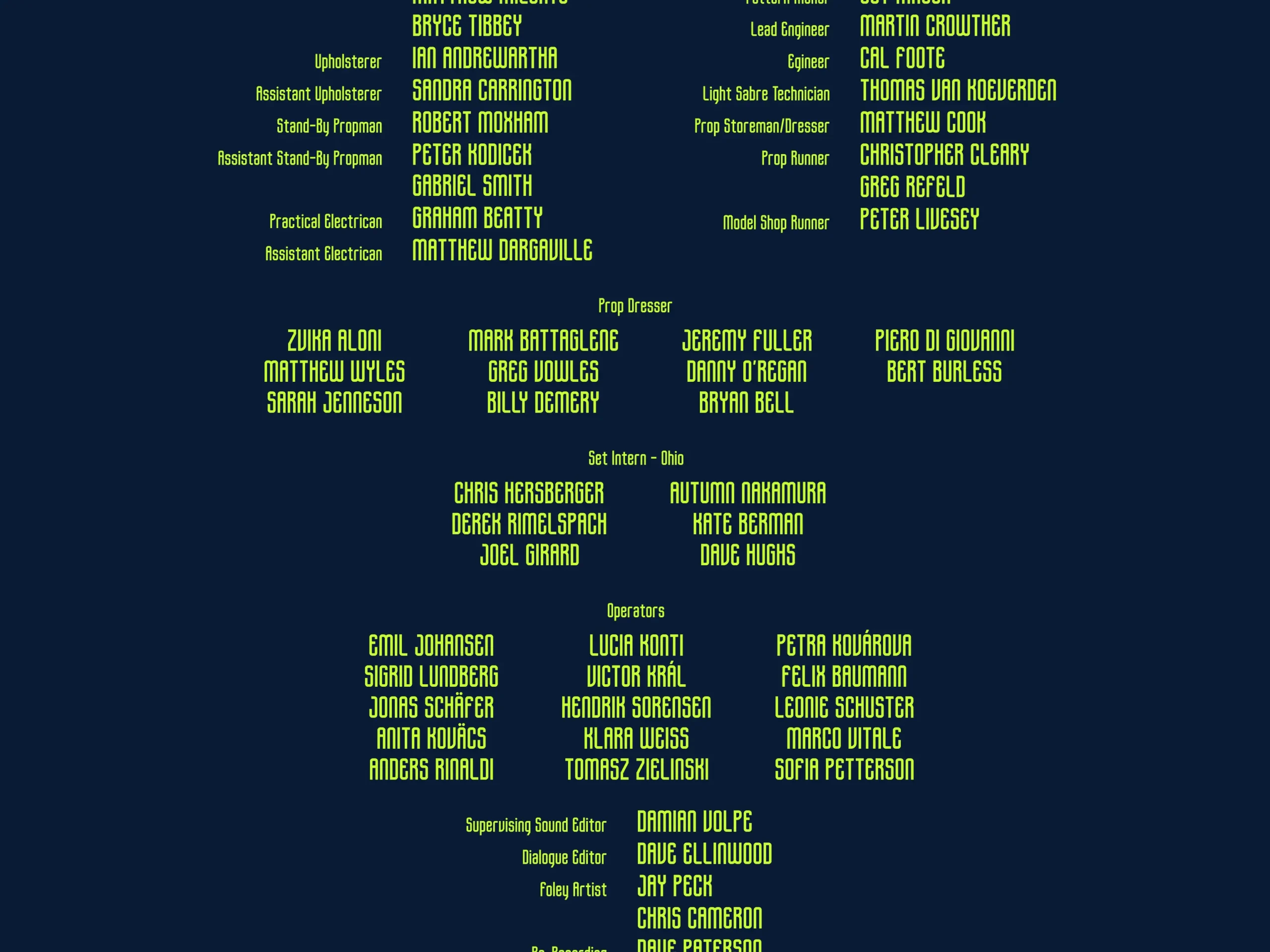
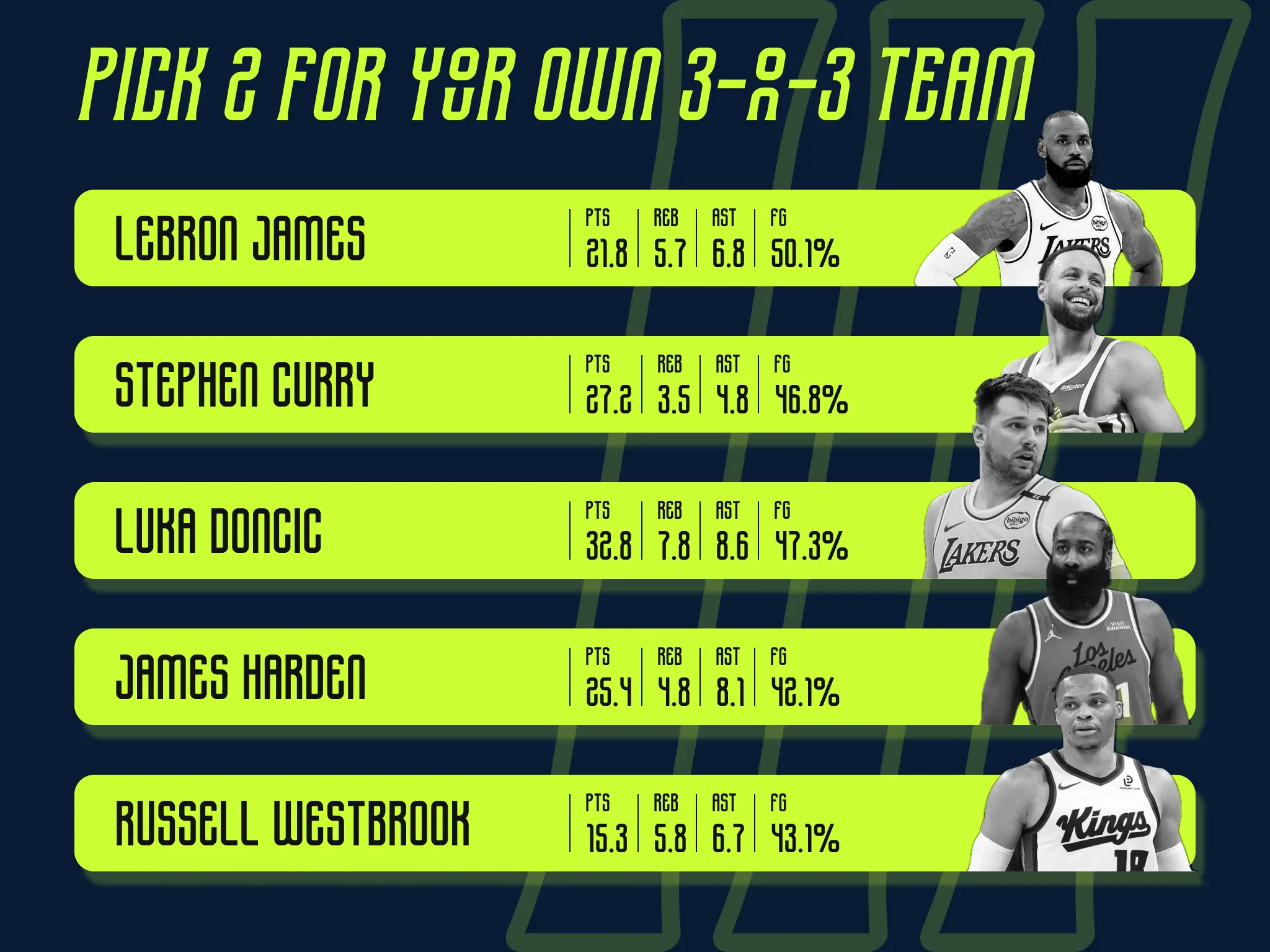
Lostlane – Sport Display Font Telemetry-style for Jersey, Sport branding and Sport Poster
Design Foundation
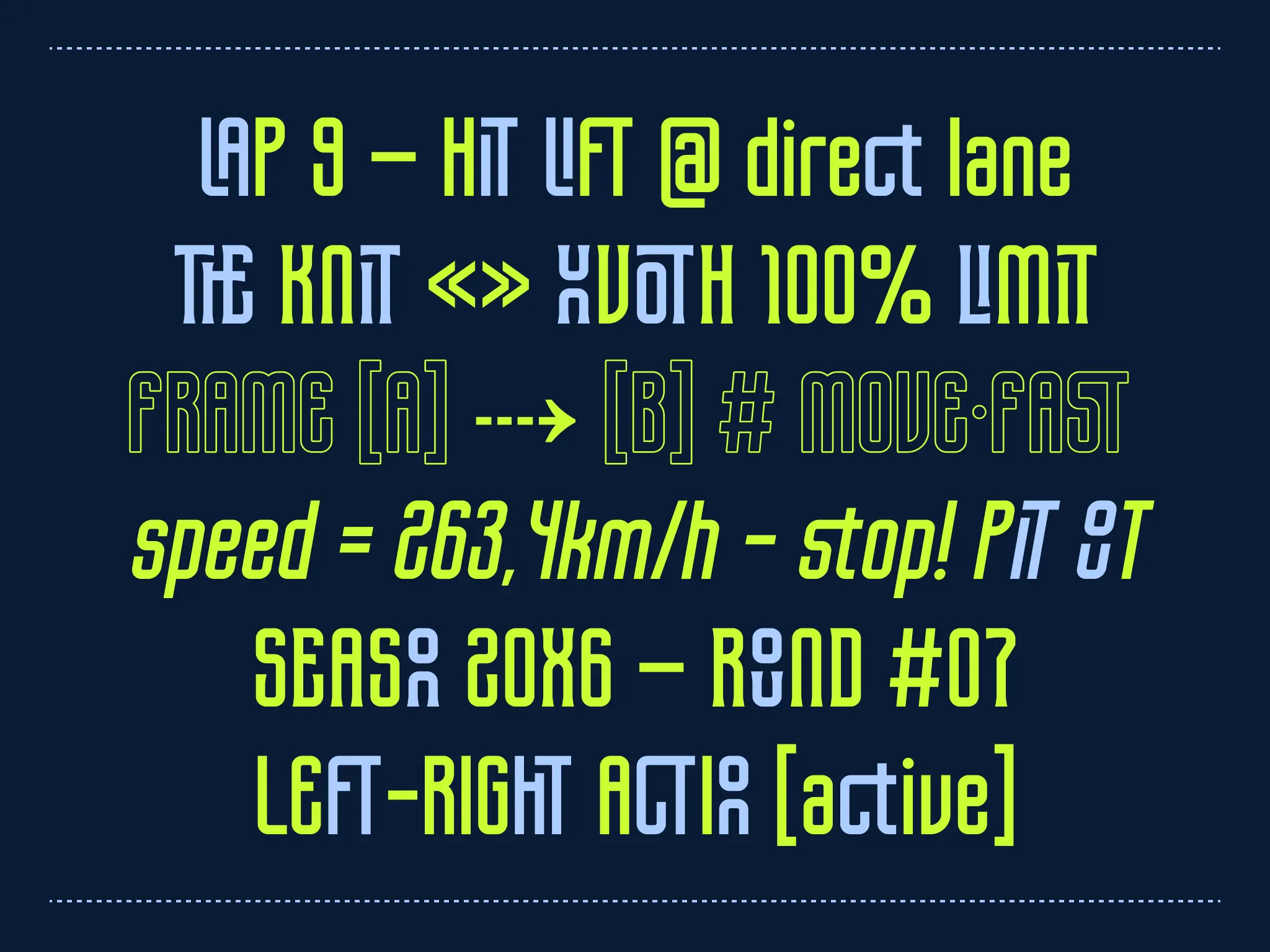
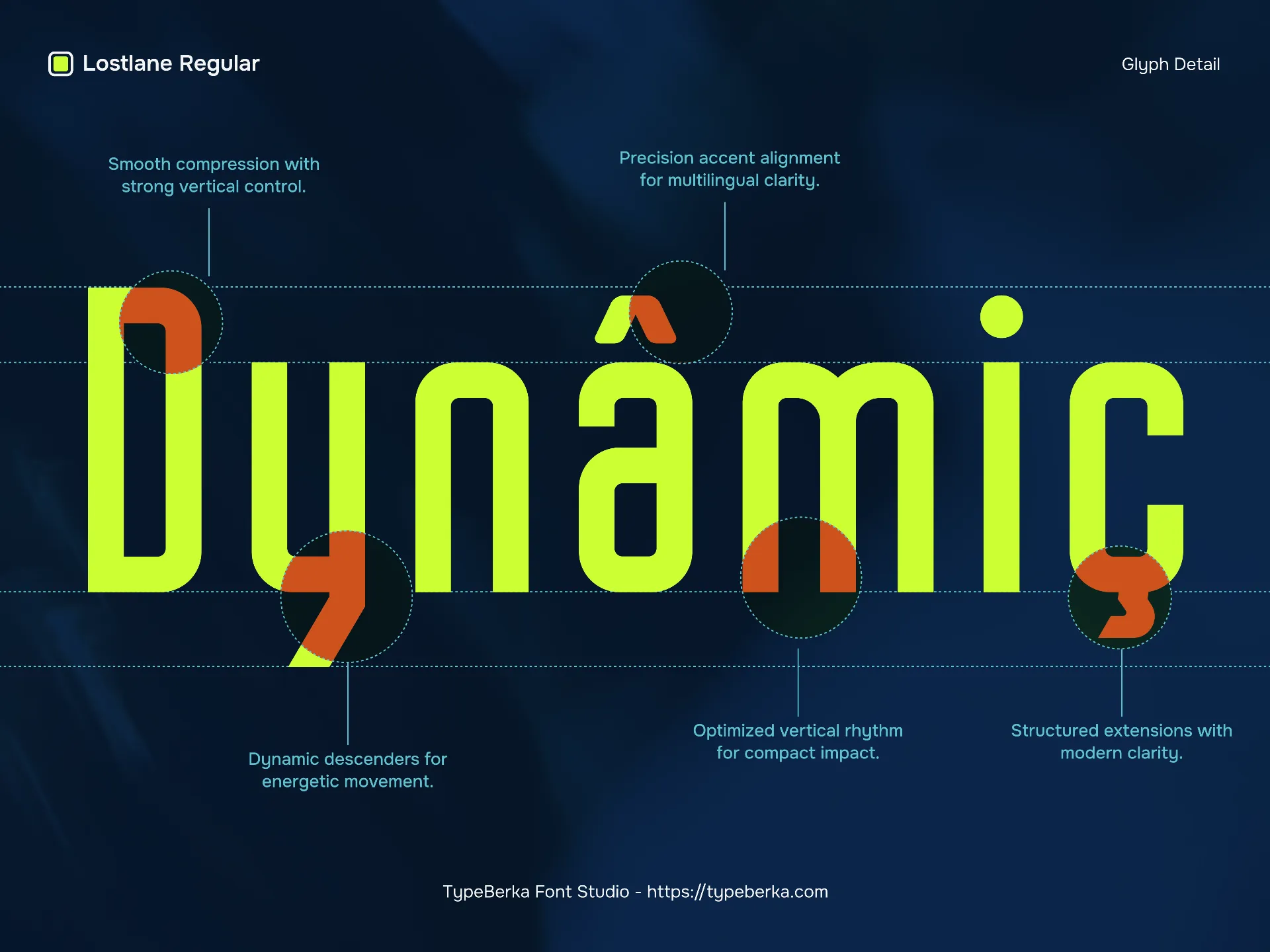
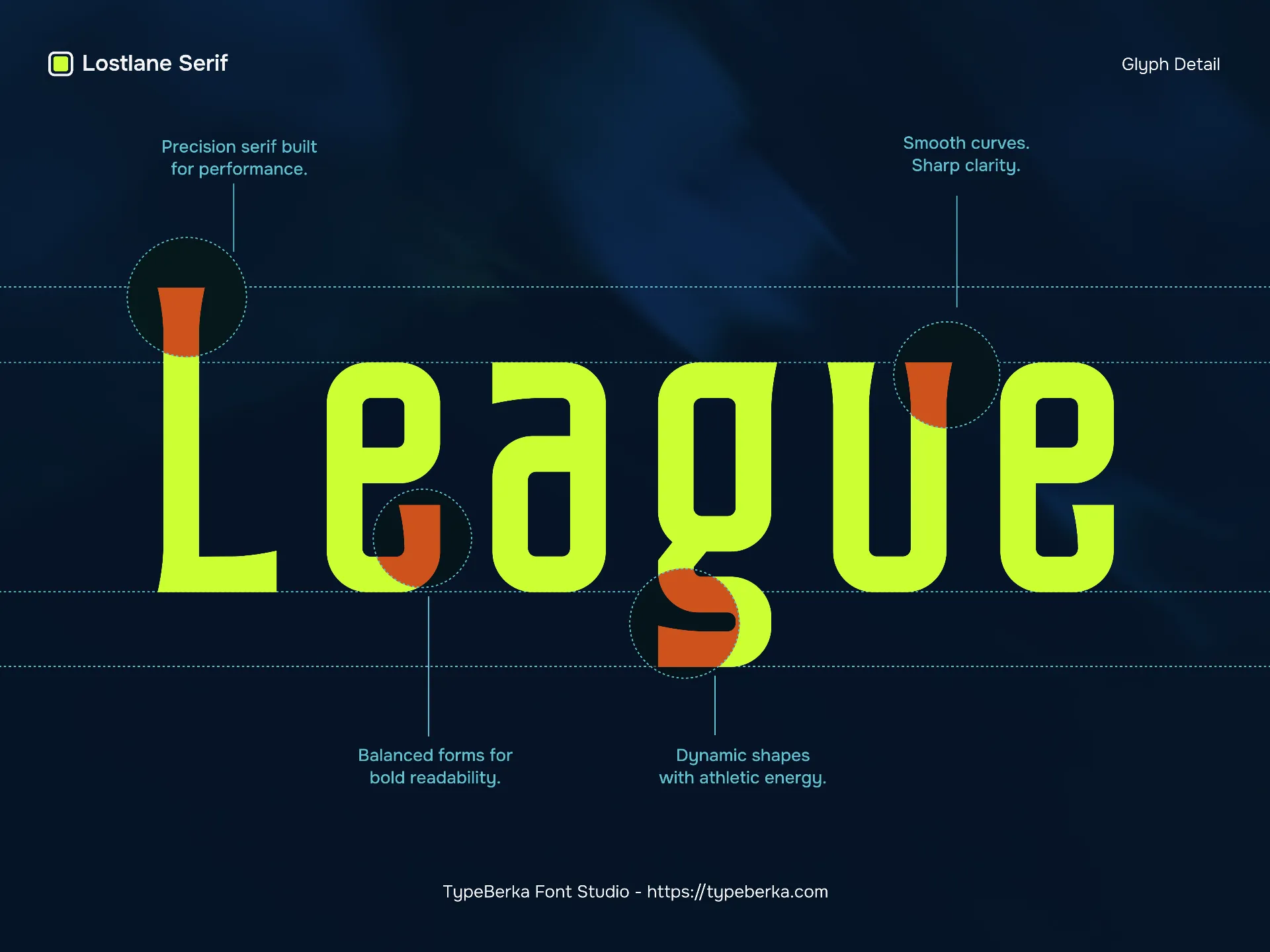
Lostlane sport display font uses narrow proportions and tall x-height decisions to fit dense information without collapsing letter identity. The shapes lean toward geometric construction with squared terminals, straight stems, and controlled curves, which helps it feel technical rather than decorative. Counters stay open in characters like A, P, R, and the numerals read as purpose-built display figures—large, upright, and spaced to prevent “stacking” when used in lap times or speed readouts.
The sample styling also shows a strong contrast between solid fills and an outlined “frame” look. That duality supports systems where hierarchy matters: primary data in solid forms, secondary labels in outline or lighter color. Overall, the rhythm stays consistent, so long strings like codes, lanes, and round markers keep a stable texture.
Functional Applications
This font suits fast-scan layouts: timing overlays, race posters, event schedules, and control-room graphics. Use it for short headlines, lane or section markers, and numeric emphasis where space is limited but clarity still matters. Its condensed build also works well in packaging or branding that needs a technical edge—especially when paired with a calmer text face for body copy.
In digital design, keep line spacing slightly generous and avoid over-tracking; the condensed forms already create tension and speed.
Technical Strength
Lostlane racing font is strongest when you use it like a system: consistent caps, firm numerals, and UI-friendly punctuation. The visible set supports bracketed labels, arrows, symbols, and operators that commonly appear in dashboards and instruction lines. Keep numerals aligned by using fixed-width settings if your layout system supports tabular behavior, and test contrast at small sizes when using outline styles.
Professional Context and Readability
Because condensed display fonts can lose clarity when over-styled, prioritize legibility rules used in interface typography: clear hierarchy, measured spacing, and predictable scale steps. For a practical baseline, Google’s Material Design typography guidance is a solid reference for sizing and hierarchy in UI contexts: https://m3.material.io/styles/typography/overview
Designed By
© TypeBerka - Font Studio
Need help or more information about font you need?