KEHRA
KEHRA is a technical display typeface defined by its rhythmic parallel stroke structure and extensive ligature system. It offers a sophisticated balance between retro-futuristic aesthetics and modern athletic branding requirements.


Included Formats
TTF, OTF, WOFF, WOFF2
Version
Lifetime updates included. You'll be notified when a new version is available.
Font Features


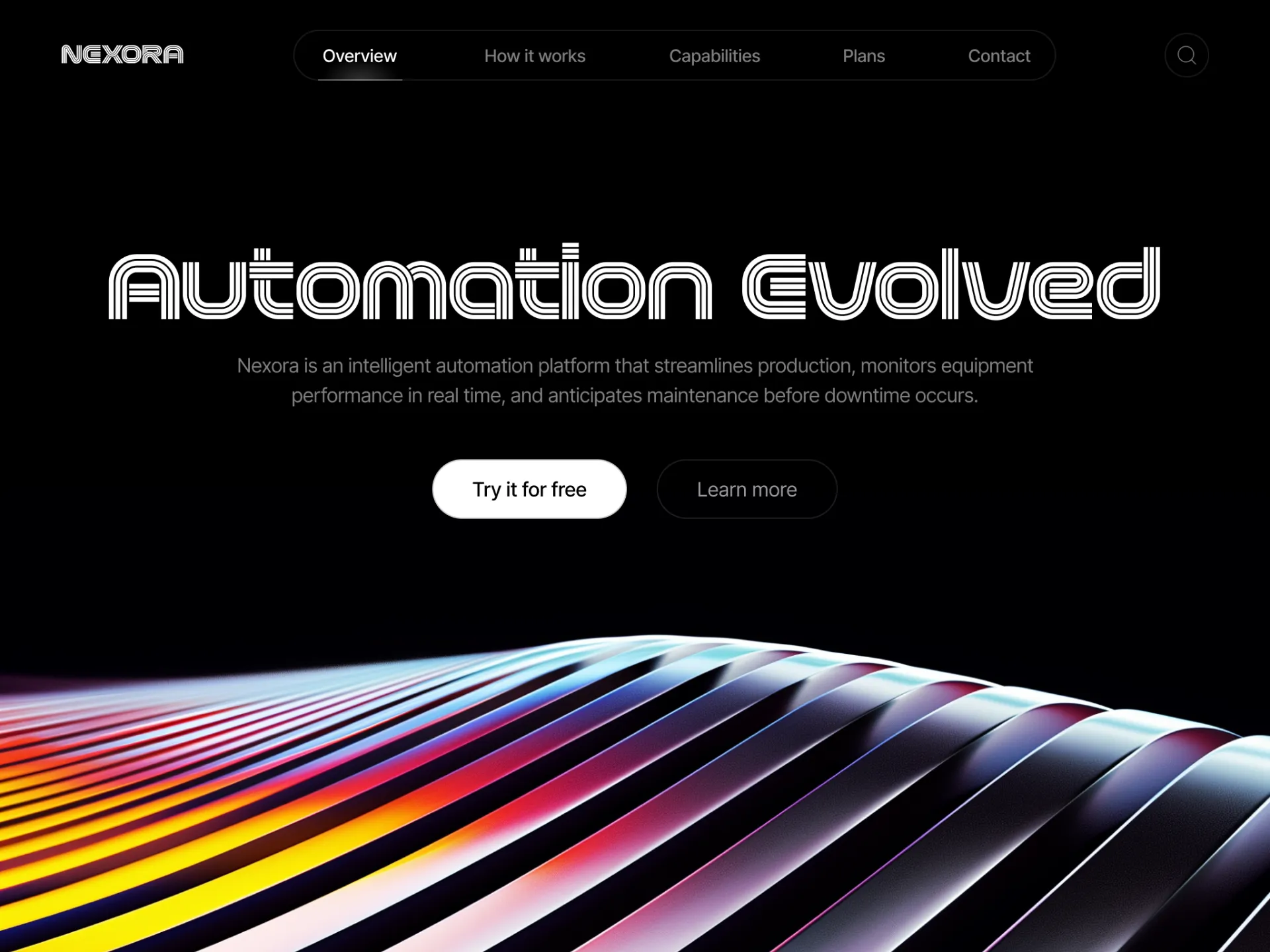
Maximizing Visual Momentum with Kinetic Display Typography
Engineering the Multi-Line Design Foundation
KEHRA is built on a strict geometric framework. In this system, form follows rhythm.
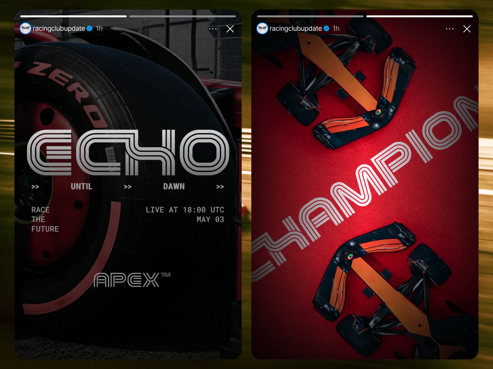
The typeface uses a parallel stroke structure. It is available in two variants: Three Line and Two Line. These layered strokes create depth while maintaining mechanical precision.
Each character combines smooth curves with carefully calculated counters. As a result, the letterforms stay stable even at large display sizes.
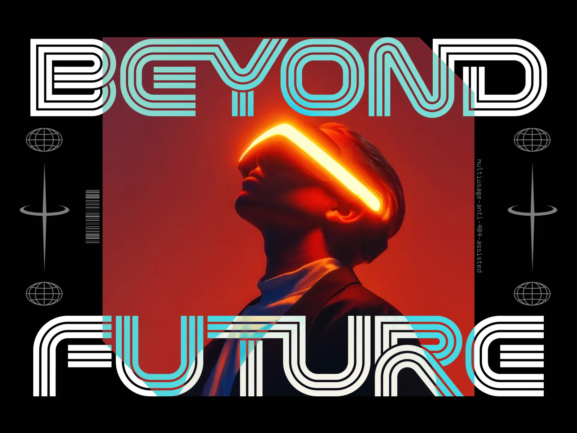
The design also draws inspiration from mid-century kinetic art and 1970s sports graphics. However, KEHRA refines these influences for modern digital environments.
Furthermore, the font maintains consistent visual weight across its variants. This consistency allows designers to adjust texture and density without losing readability.
The italic versions add sharp horizontal terminals and extended speed strokes. Consequently, the design creates a strong forward motion that suggests velocity and technical performance.
Strategic Versatility in Athletic and Tech Branding
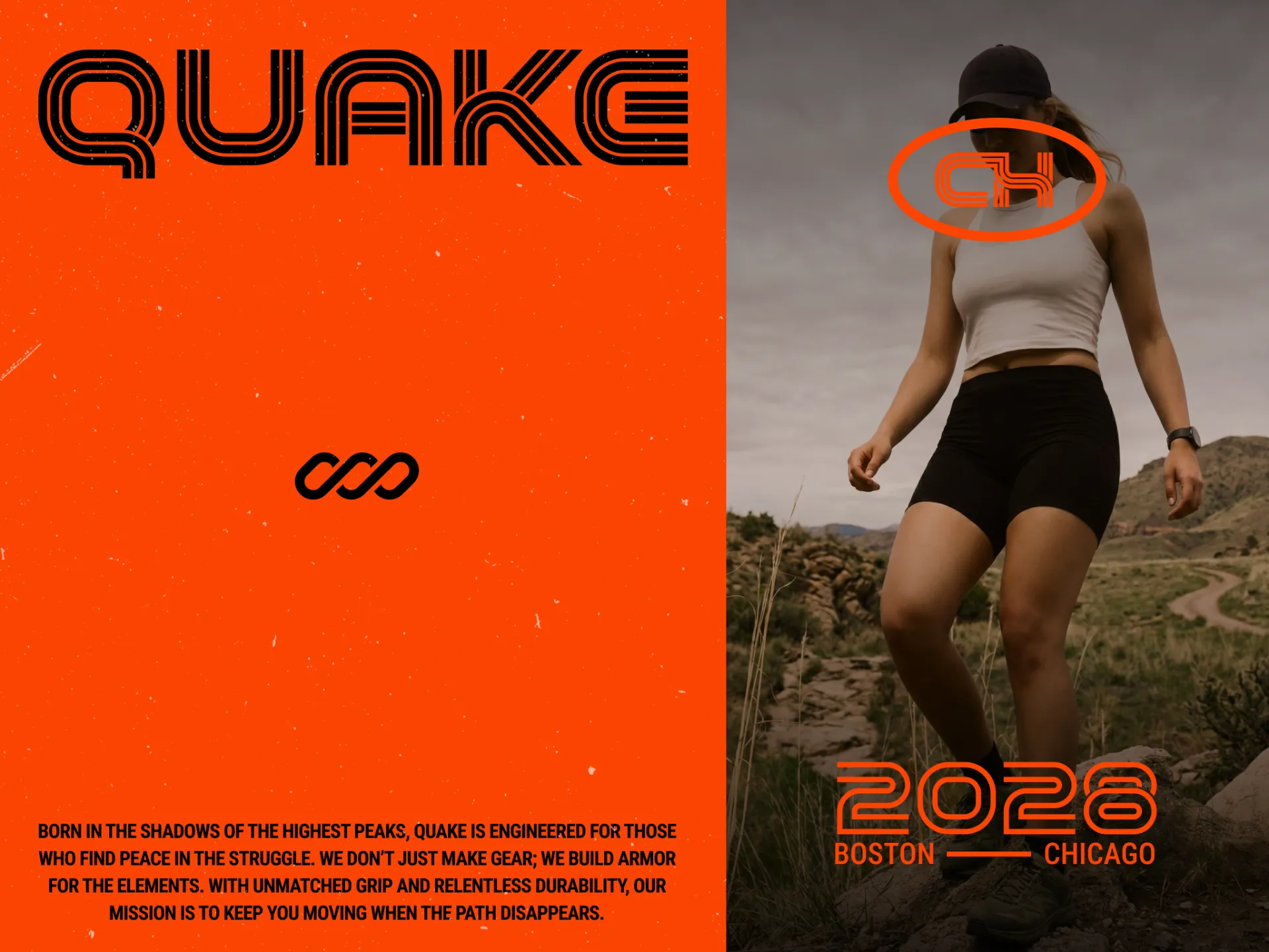
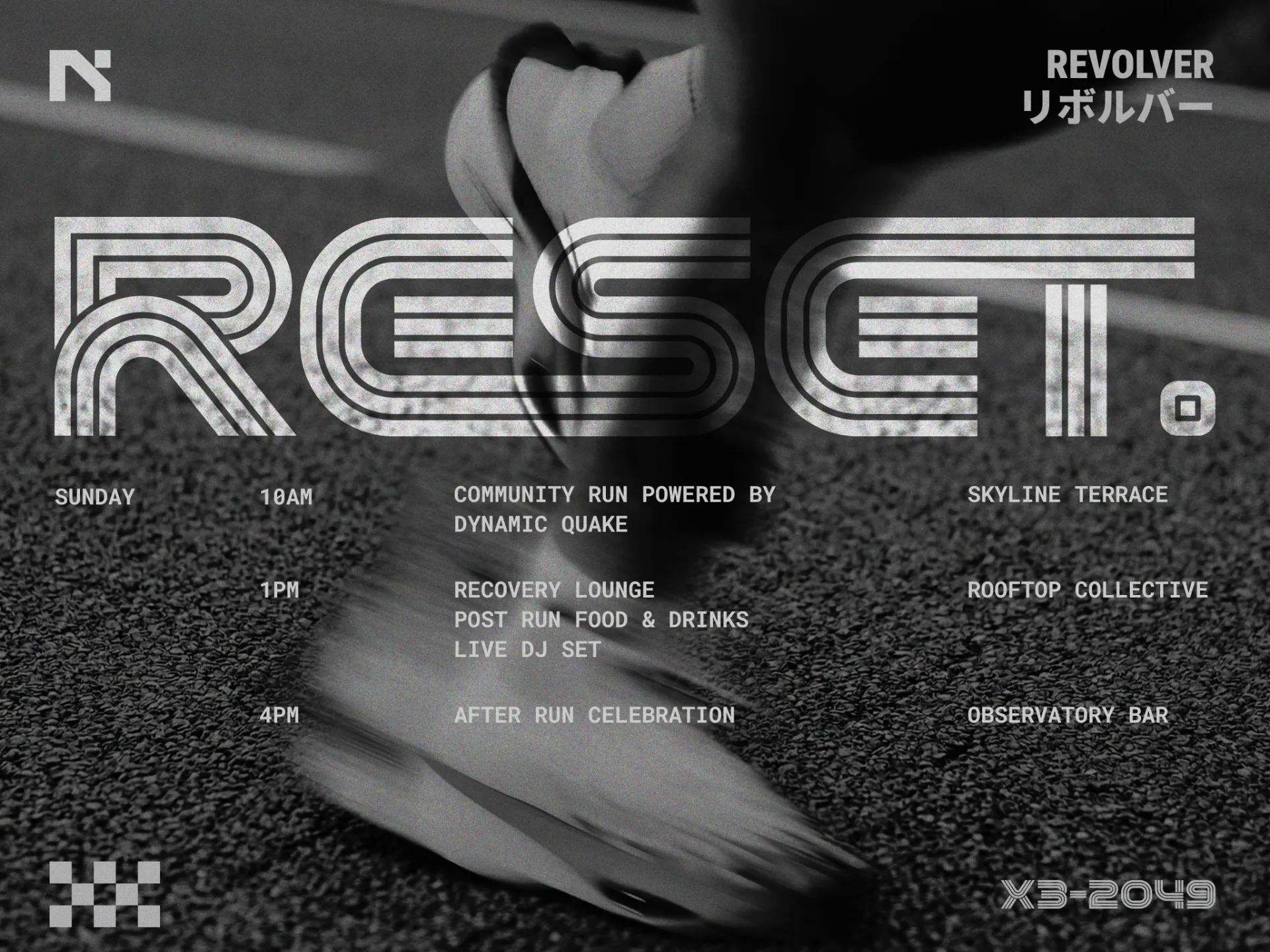
KEHRA naturally fits sports branding. Designers can use it for jersey numbers, team identities, and competition graphics.
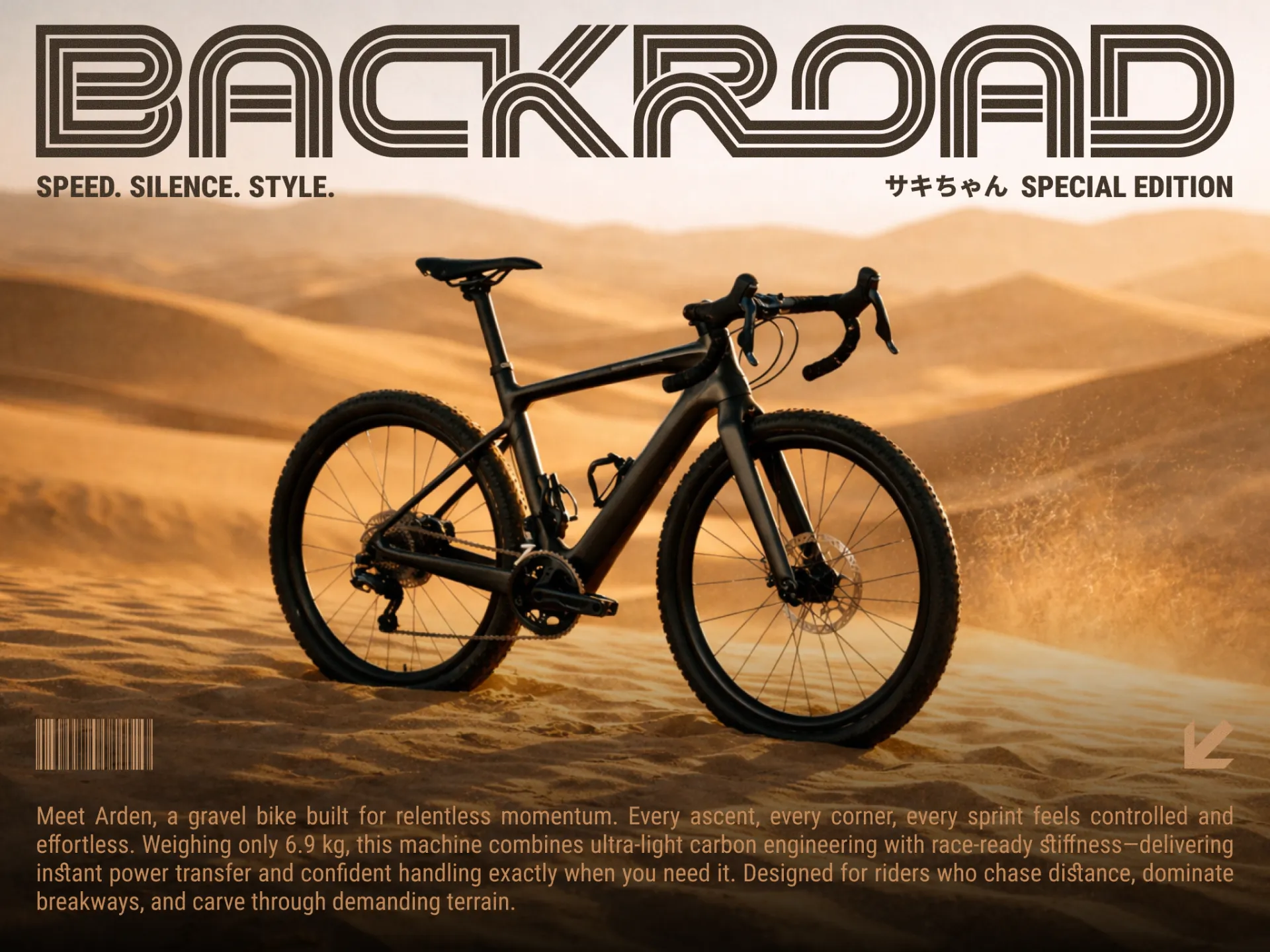
However, its application goes far beyond sports. The structured geometry also works well in technology branding and premium lifestyle design.
For example, the rhythmic parallel strokes create a subtle visual vibration. This effect attracts attention in fast environments such as broadcast graphics, esports overlays, and motion design.
In apparel production, the block-like structure offers strong physical stability. Therefore, the font performs well in screen printing and embroidery.
Moreover, KEHRA pairs easily with neutral sans-serif fonts. Designers can combine it with a clean font such as LOSTLANE to build same vibes.
In this system, KEHRA provides the visual impact. Meanwhile, the secondary font handles longer informational content.
As a result, the typeface works equally well for digital interfaces and physical merchandise.
Advanced Technical Architecture and Ligature System
One of the most significant strengths of KEHRA is its massive library of over 150 ligatures. This feature transforms standard text into custom-looking wordmarks with a single toggle. The ligatures are designed to create a seamless flow between characters, bridging the gaps in the parallel line system to create unified, interlocking shapes. This level of technical detail is essential for creating distinctive identities that feel bespoke rather than templated.
The typeface provides comprehensive multilingual support, covering a wide array of Latin-based languages with consistent diacritic placement that respects the font’s geometric integrity. The inclusion of a robust numeral and symbol set ensures that it functions effectively for data-driven applications, such as scoreboards or technical specification sheets. According to industry standards for geometric type design, maintaining consistent stroke gaps is vital for optical clarity, a principle KEHRA follows to ensure high performance across various display resolutions and print mediums.
Designed By
© TypeBerka - Font Studio
Need help or more information about font you need?