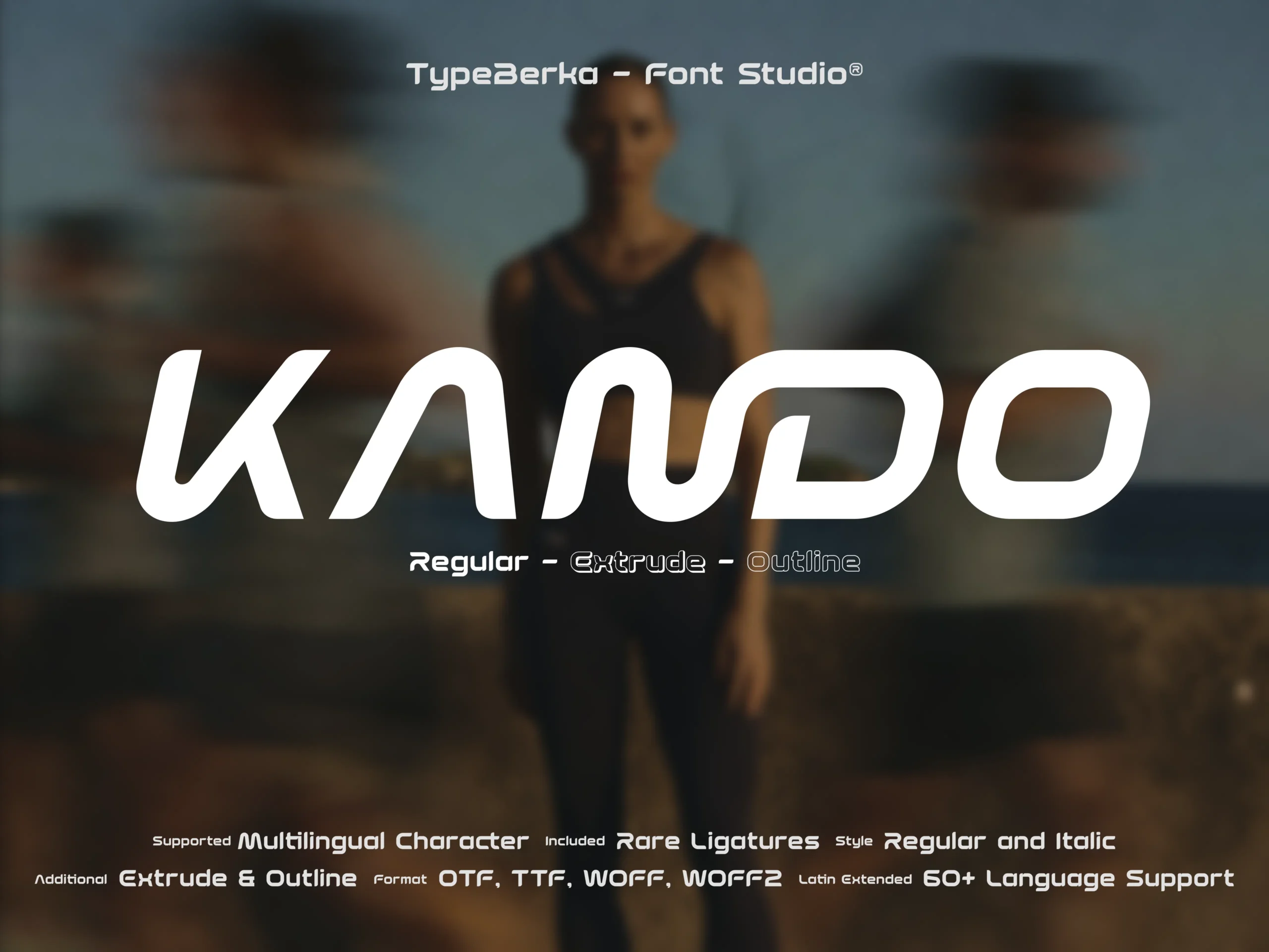
KANDO
Kando is a geometric techno display font with smooth, aerodynamic curves and open terminals. It delivers stable, high-contrast shapes for branding, posters, and digital interfaces.
Included Formats
TTF, OTF, WOFF, WOFF2
Version
Lifetime updates included. You'll be notified when a new version is available.
Font Features
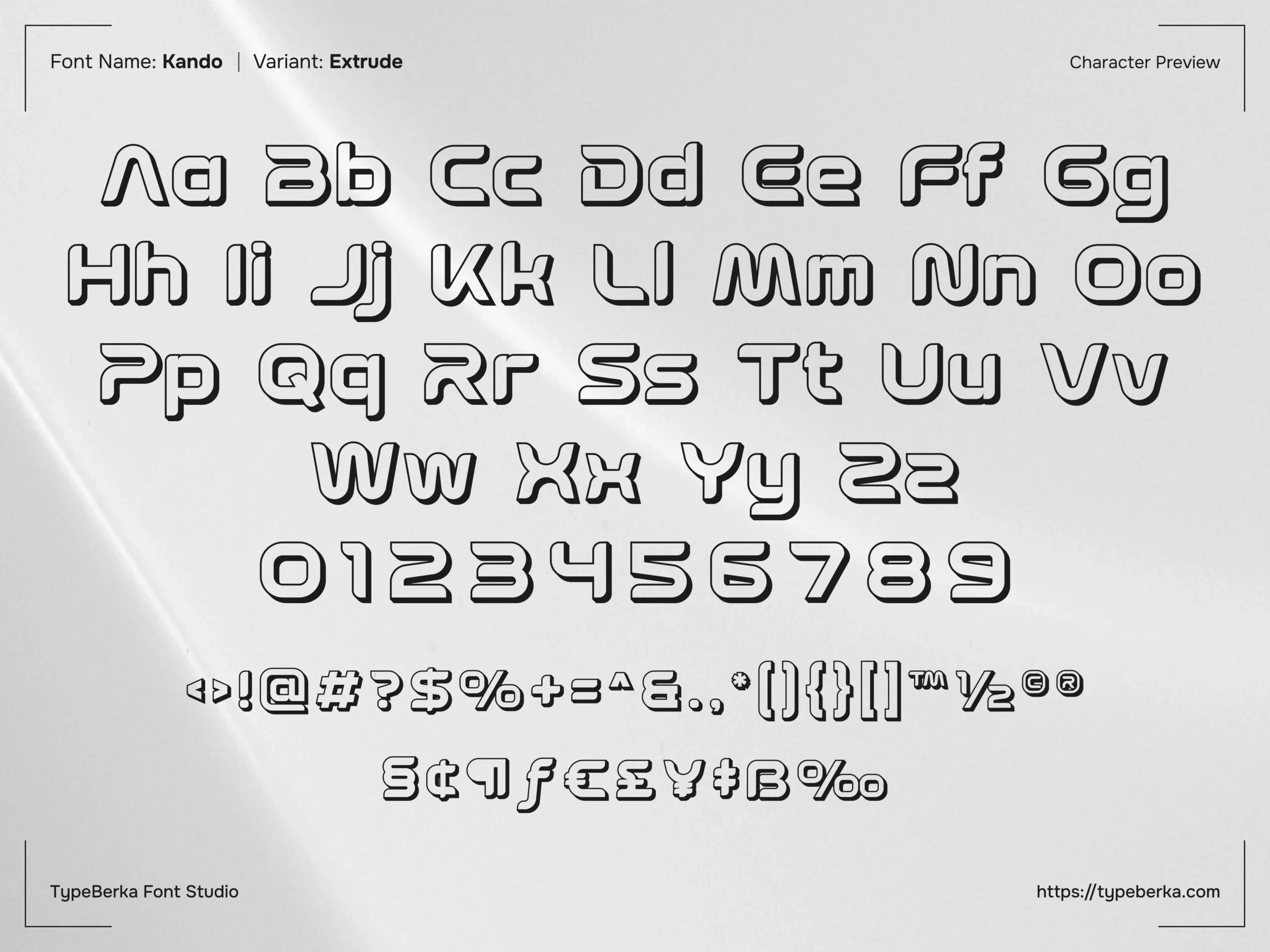

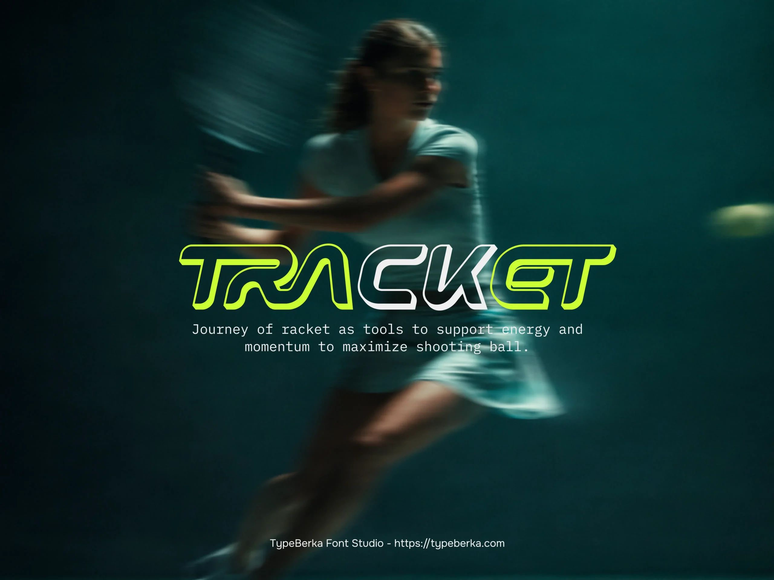
KANDO – Geometric Techno Futuristic Display Font for Branding, UI, and Posters
Kando is a techno display font built around rounded geometry and controlled stroke endings. The letterforms maintain their structure even at large sizes or wider tracking.
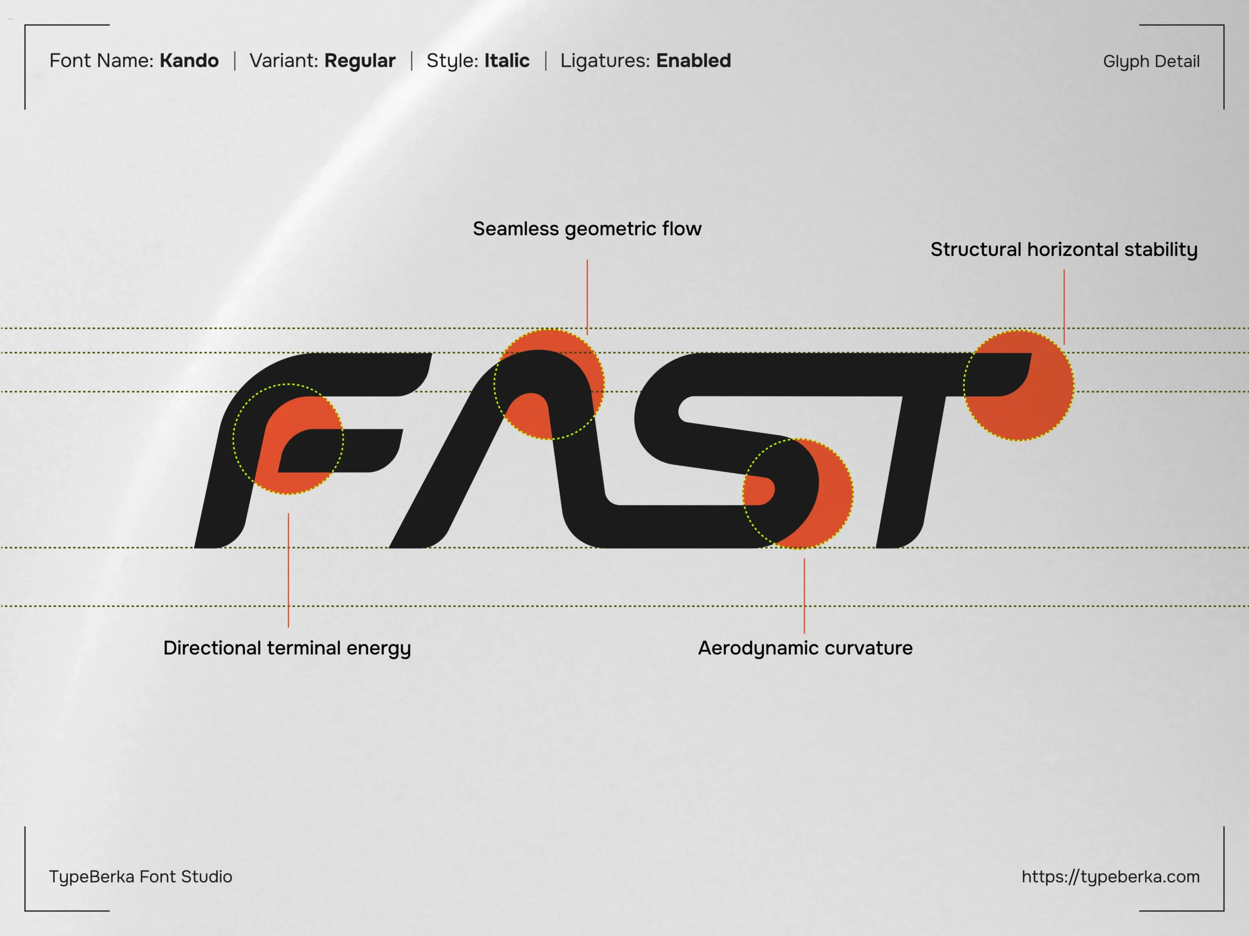
This balance gives the design a clean and deliberate technical feel. Open terminals and consistent radii guide the eye through each character. The italic style adds directional energy while keeping the baseline stable.
Design Foundation
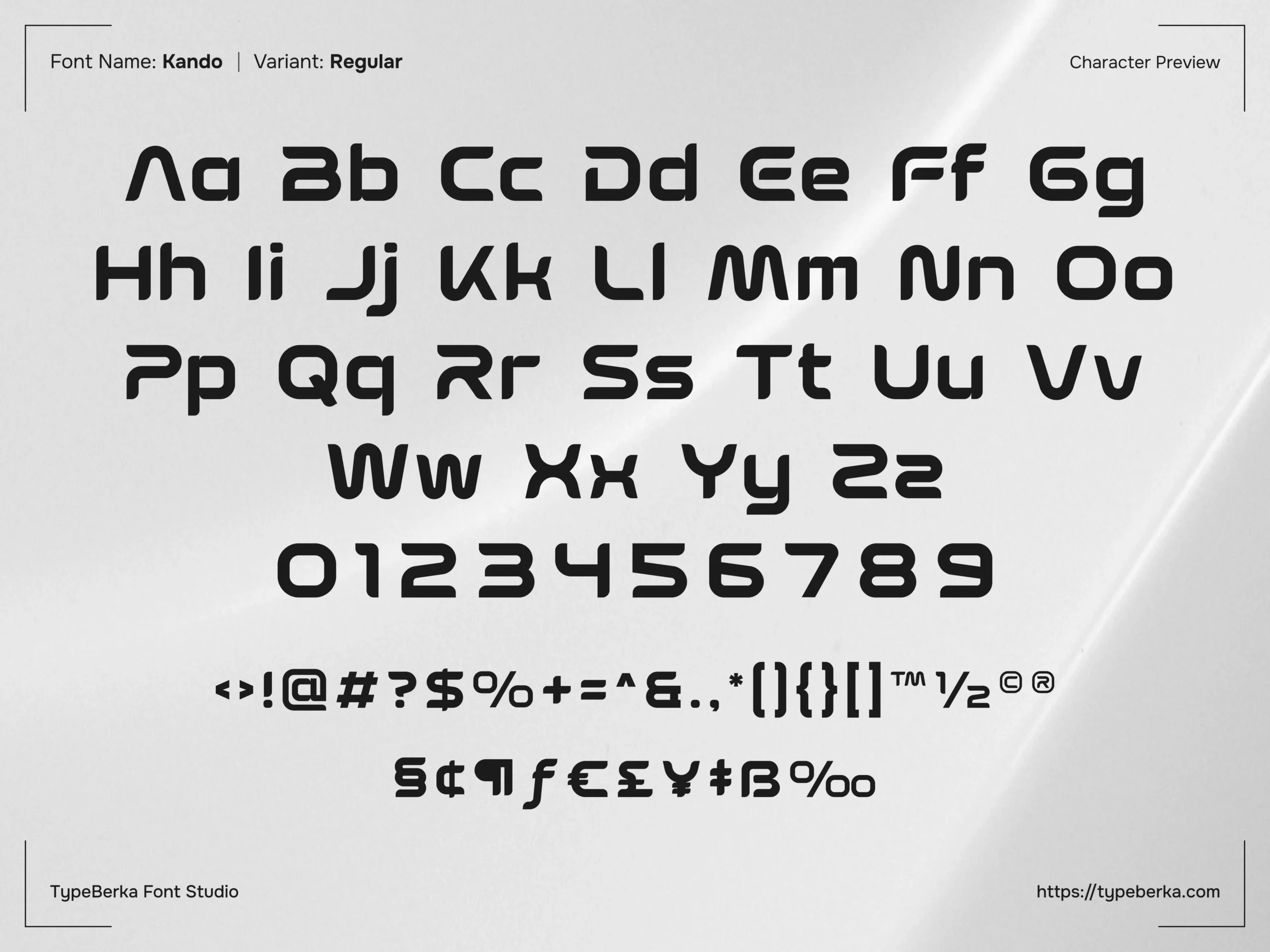
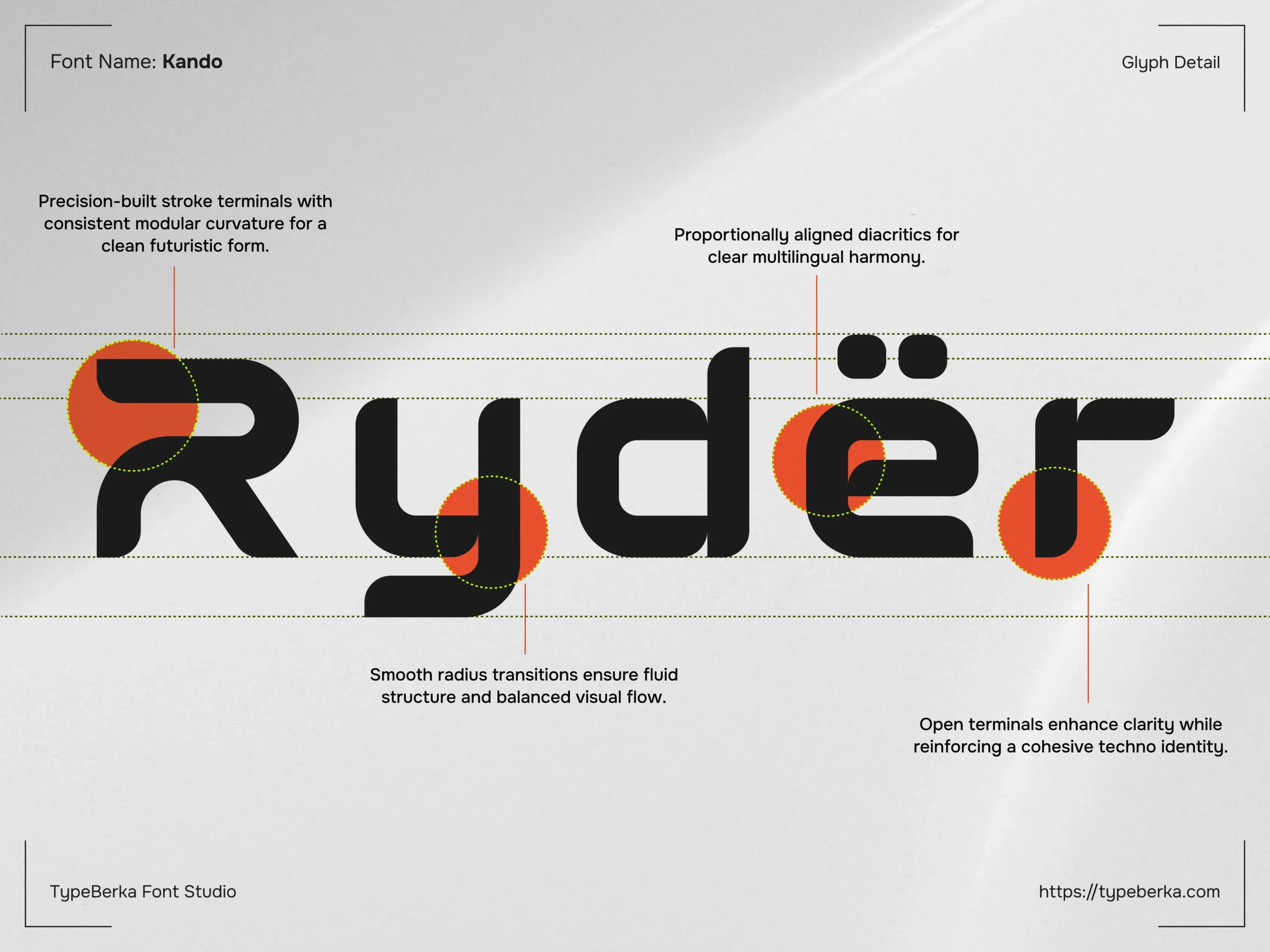
Kando uses modular curves and softened corners to create a continuous visual path across stems, bowls, and joints.
The structure leans toward a wide contemporary sans-serif. However, the terminals and interior cuts push the design into a techno-inspired direction.
You can see this clearly in characters like E, S, and G. These letters keep open counters and end strokes with crisp, engineered stops.
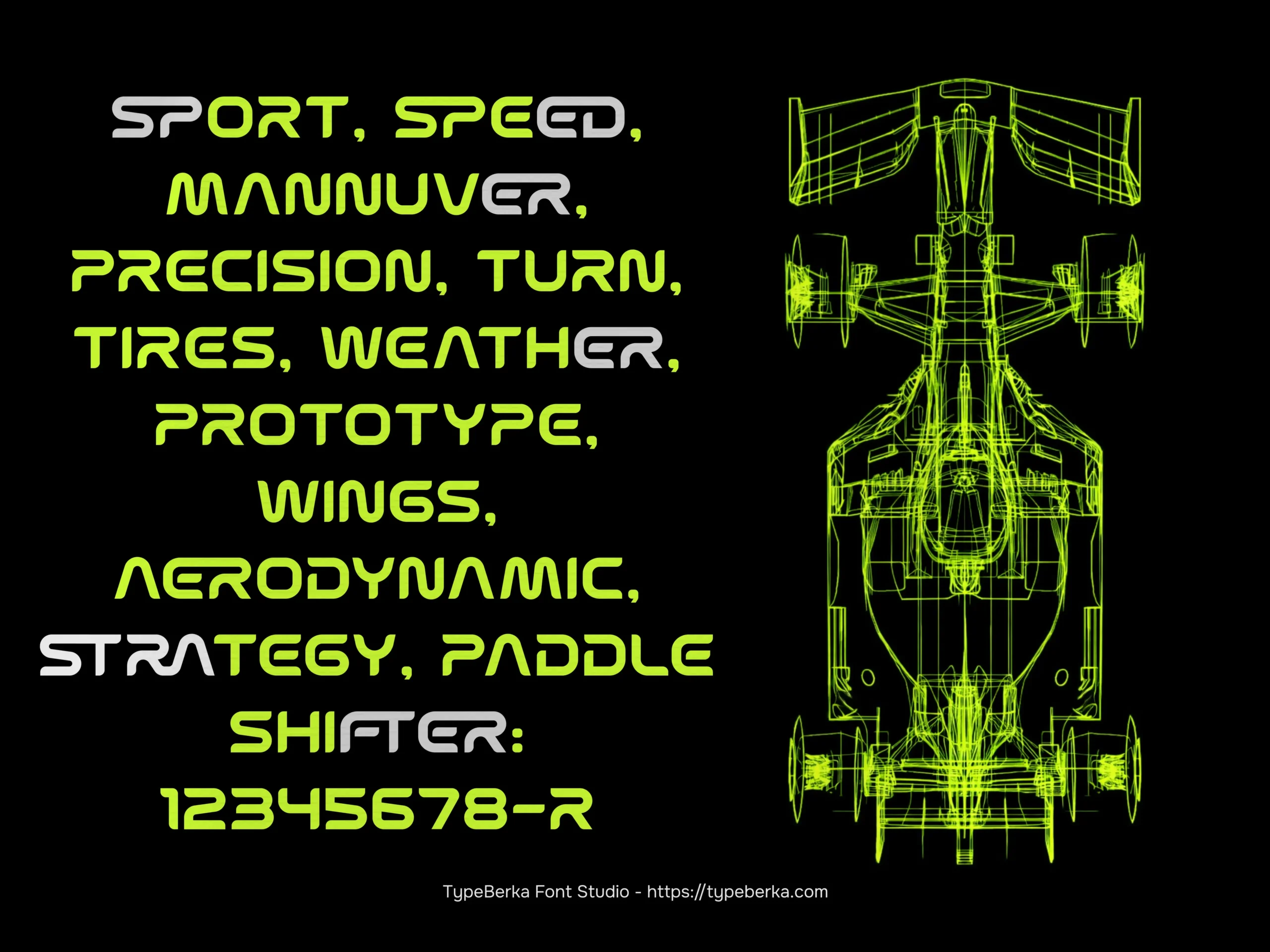
The numerals follow the same construction logic. They maintain a compact and modern footprint that works well in labels, badges, and bold headline layouts.
Functional Applications
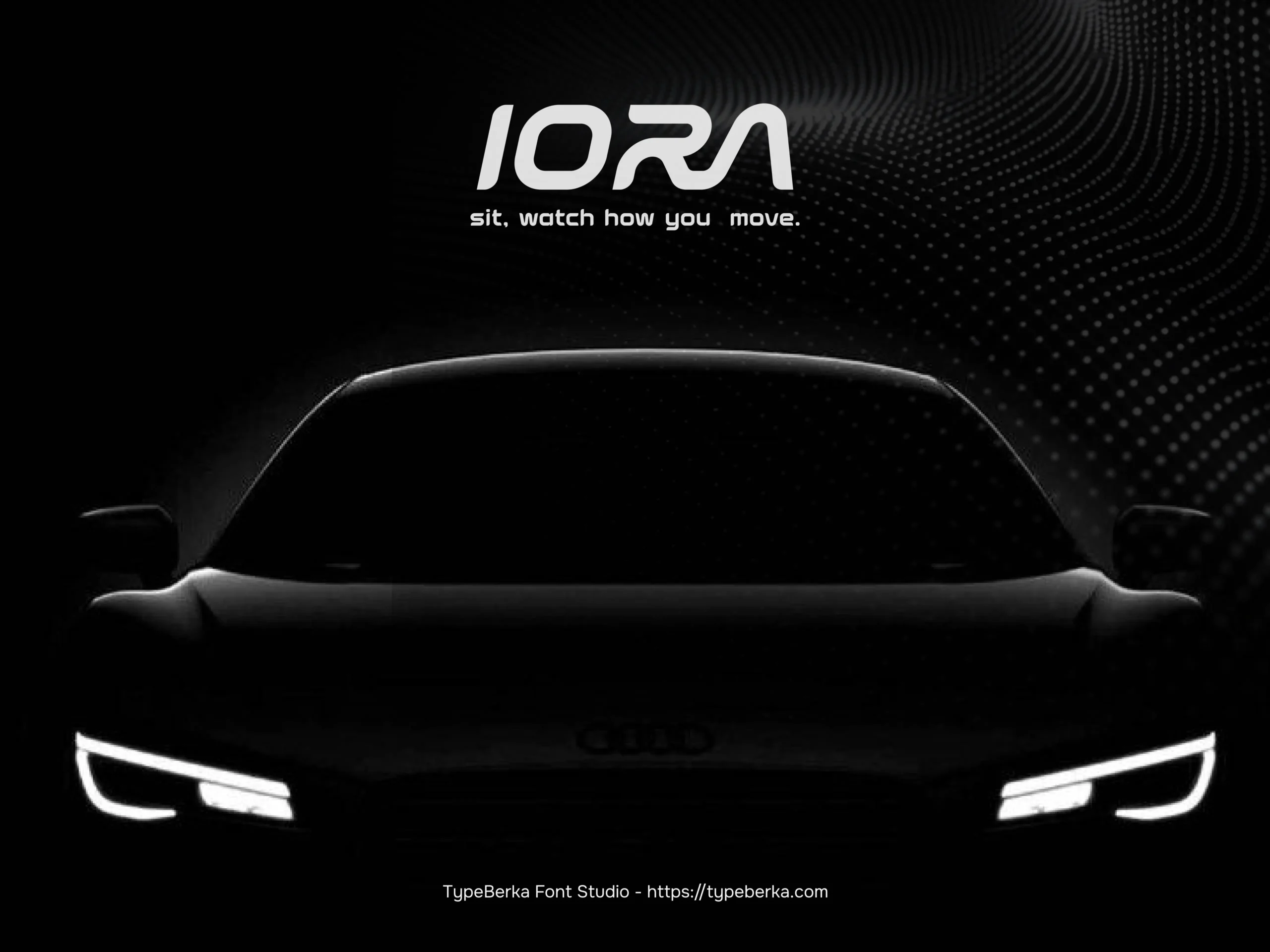
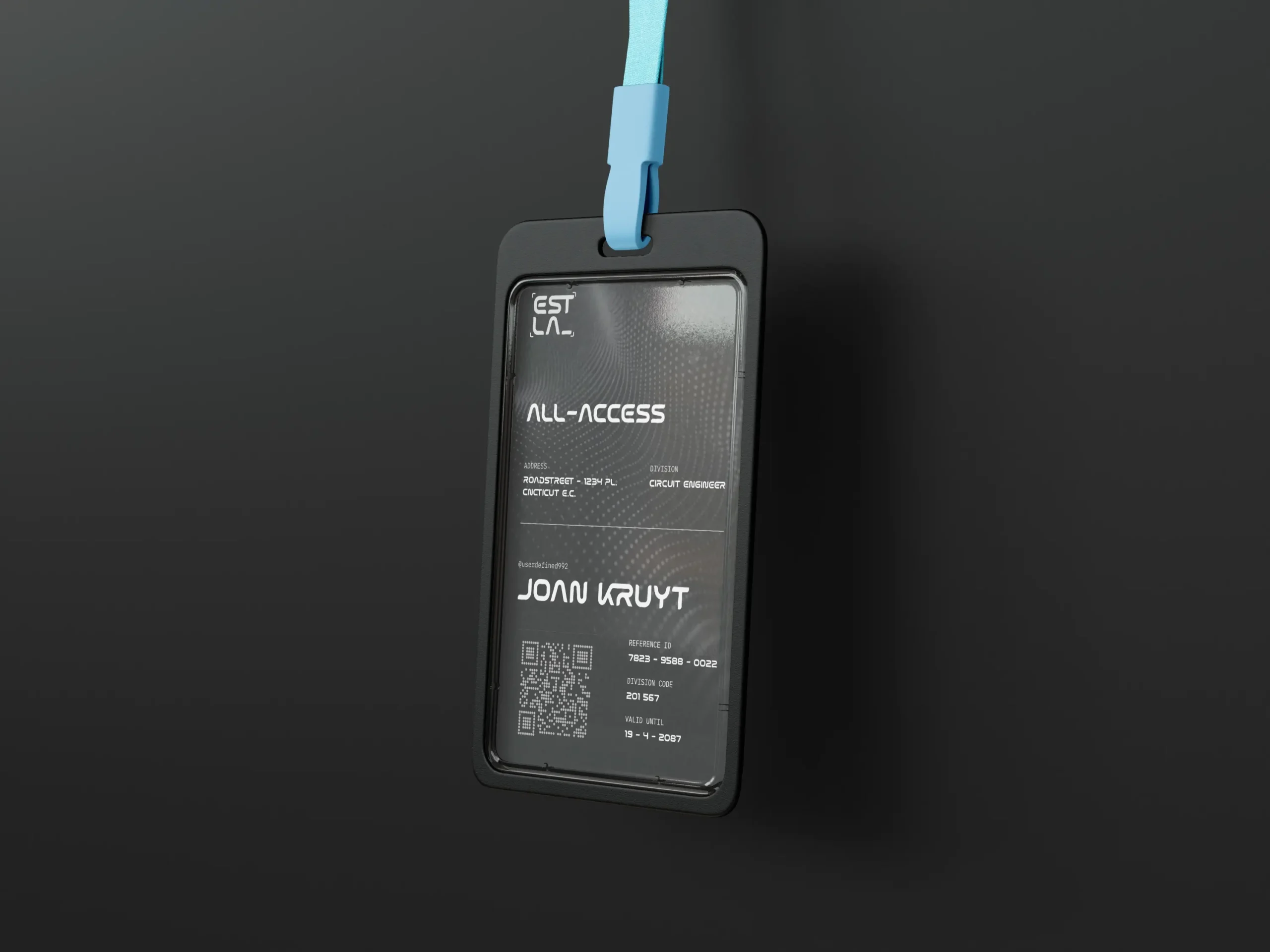
Kando works best in display typography where clarity and identity must work together.
Designers can use it for logotypes, esports-style naming systems, event headers, packaging titles, and motion graphics. The rounded structure keeps text readable during animation or scaling.
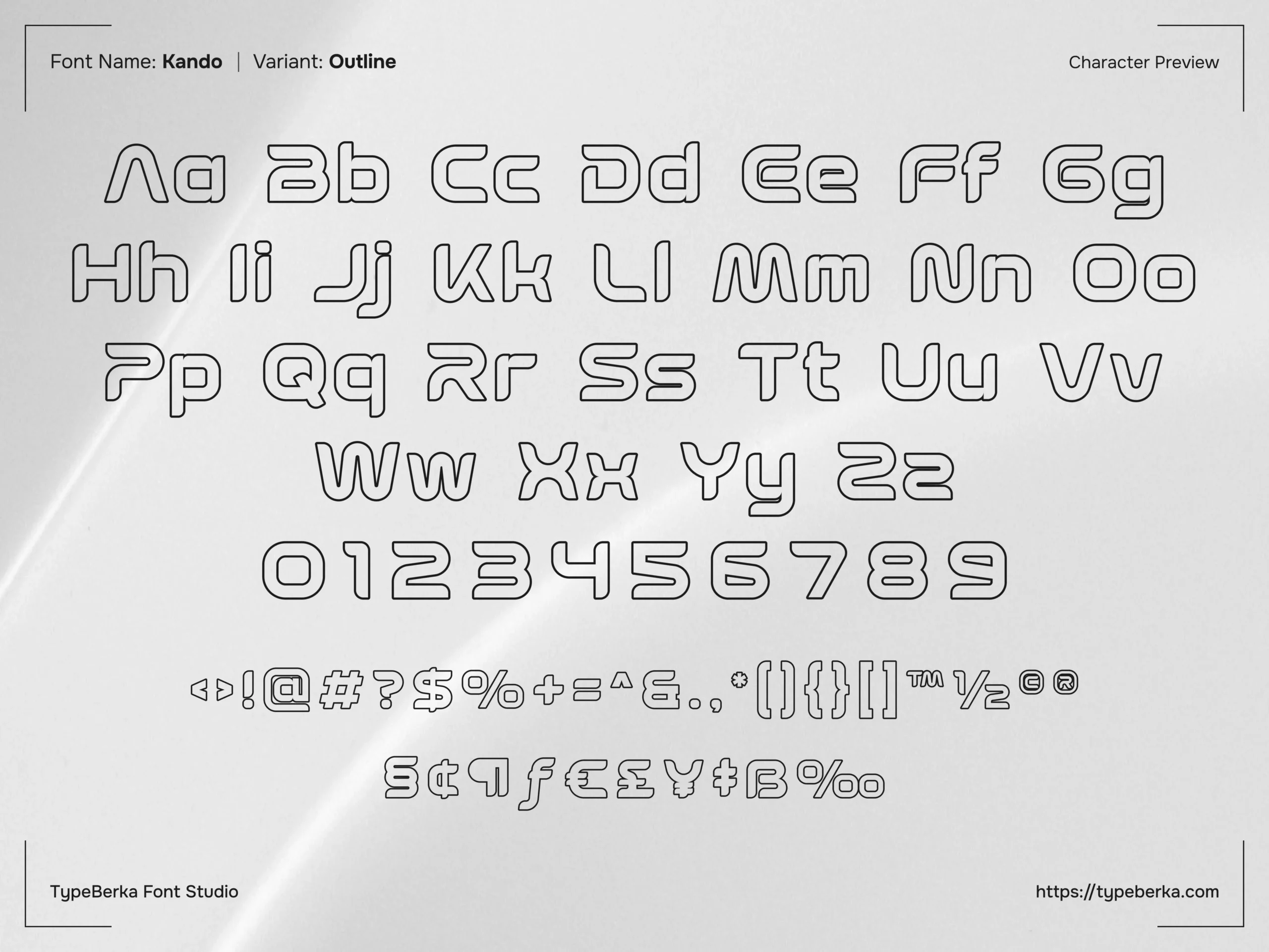
The Outline and Extrude styles allow designers to build layered treatments and dimensional lockups. These variants help create depth without relying on heavy graphic effects.
Technical Strength
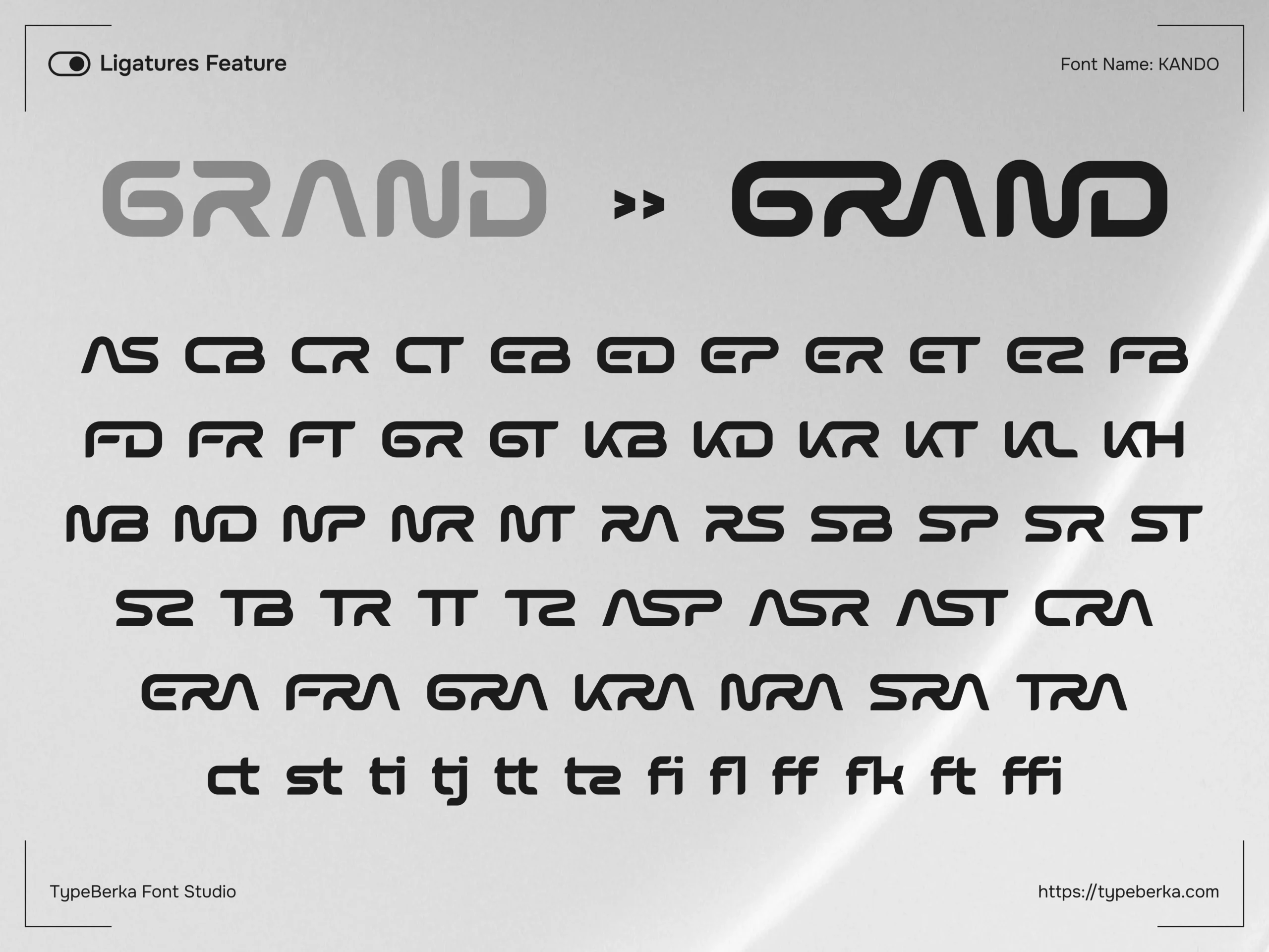
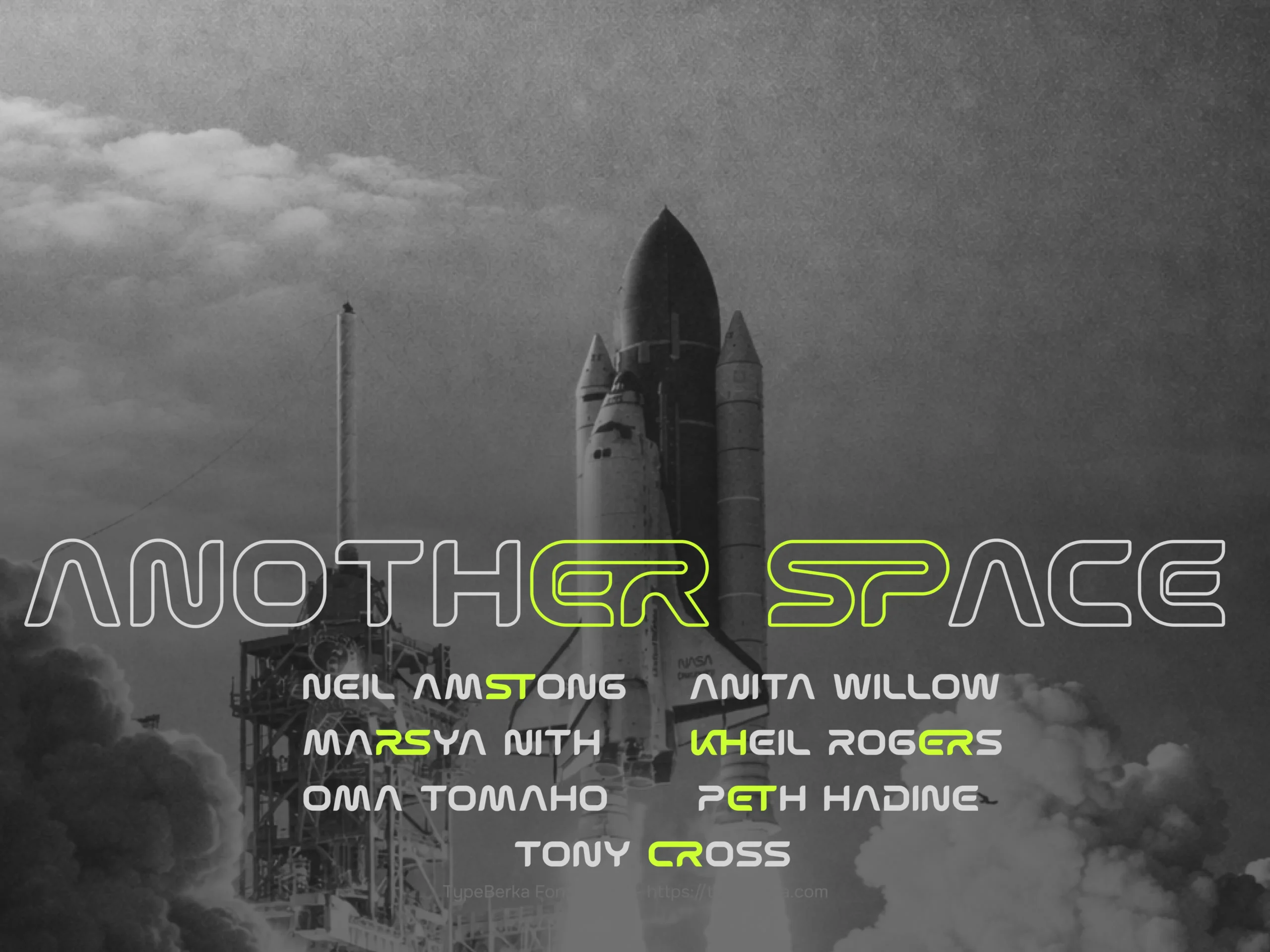
Kando includes a ligature set that improves common letter pairs. These ligatures create smoother connections in compact wordmarks and all-caps headers.
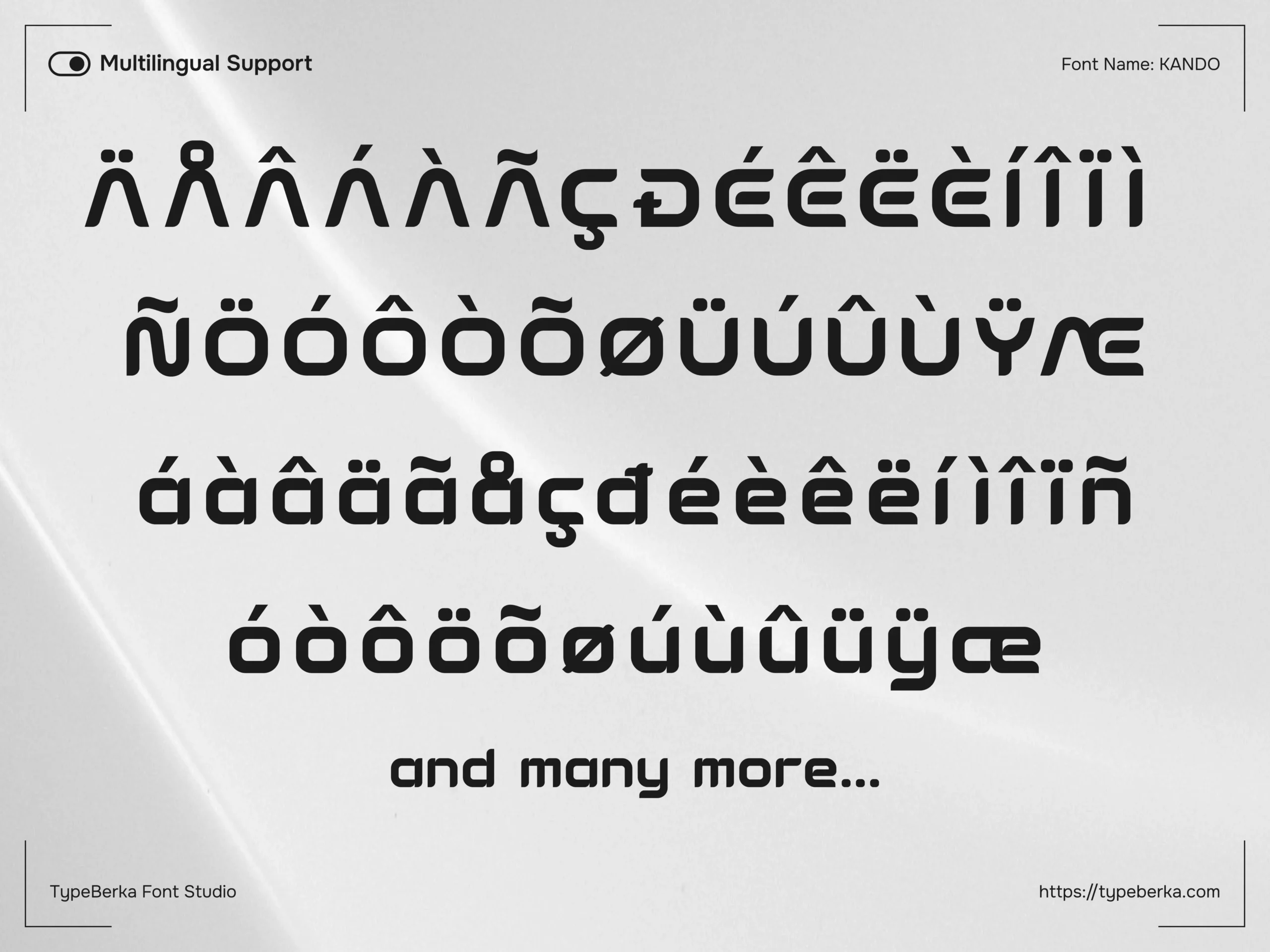
The font also supports extended Latin characters. Carefully aligned diacritics keep the cap height and accent spacing consistent across languages.
Designers who use OpenType features in professional software can activate these behaviors automatically. For more details about how OpenType features work in modern typography, see the OpenType overview.
Designed By
© TypeBerka - Font Studio
Need help or more information about font you need?