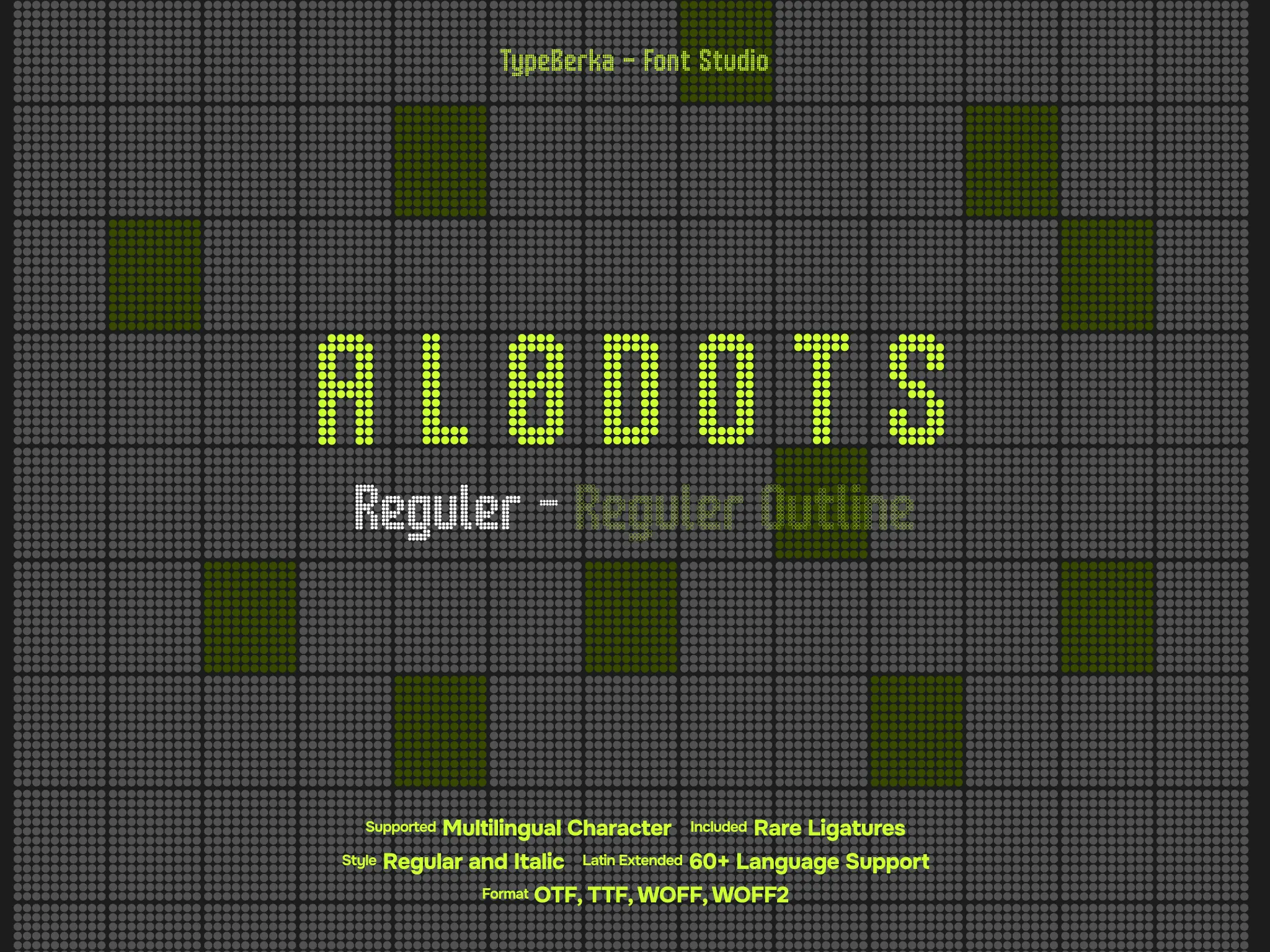
Alodots
Alodots is a precision-engineered grid-based typeface inspired by classic electronic displays and modern digital interfaces. It excels in high-visibility contexts ranging from smartwatch complications to large-scale stadium scoreboards.

Included Formats
TTF, OTF, WOFF, WOFF2
Version
Lifetime updates included. You'll be notified when a new version is available.
Font Features

Digital Precision with Alodots Display Typeface
Alodots transforms the mechanical language of LED and LCD displays into a versatile digital typeface. The design follows a strict grid system, where each character uses uniform circular dots to maintain clarity and readability.
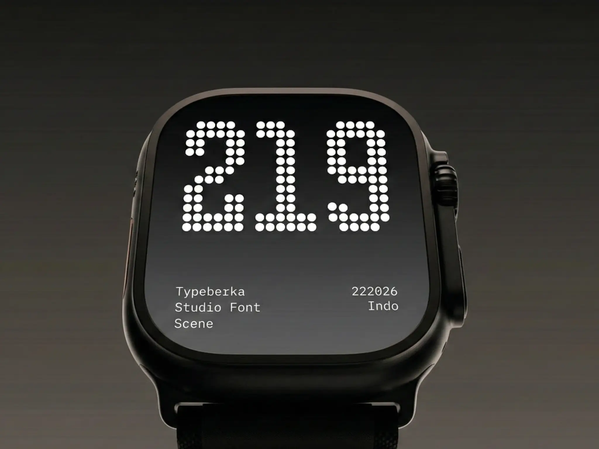
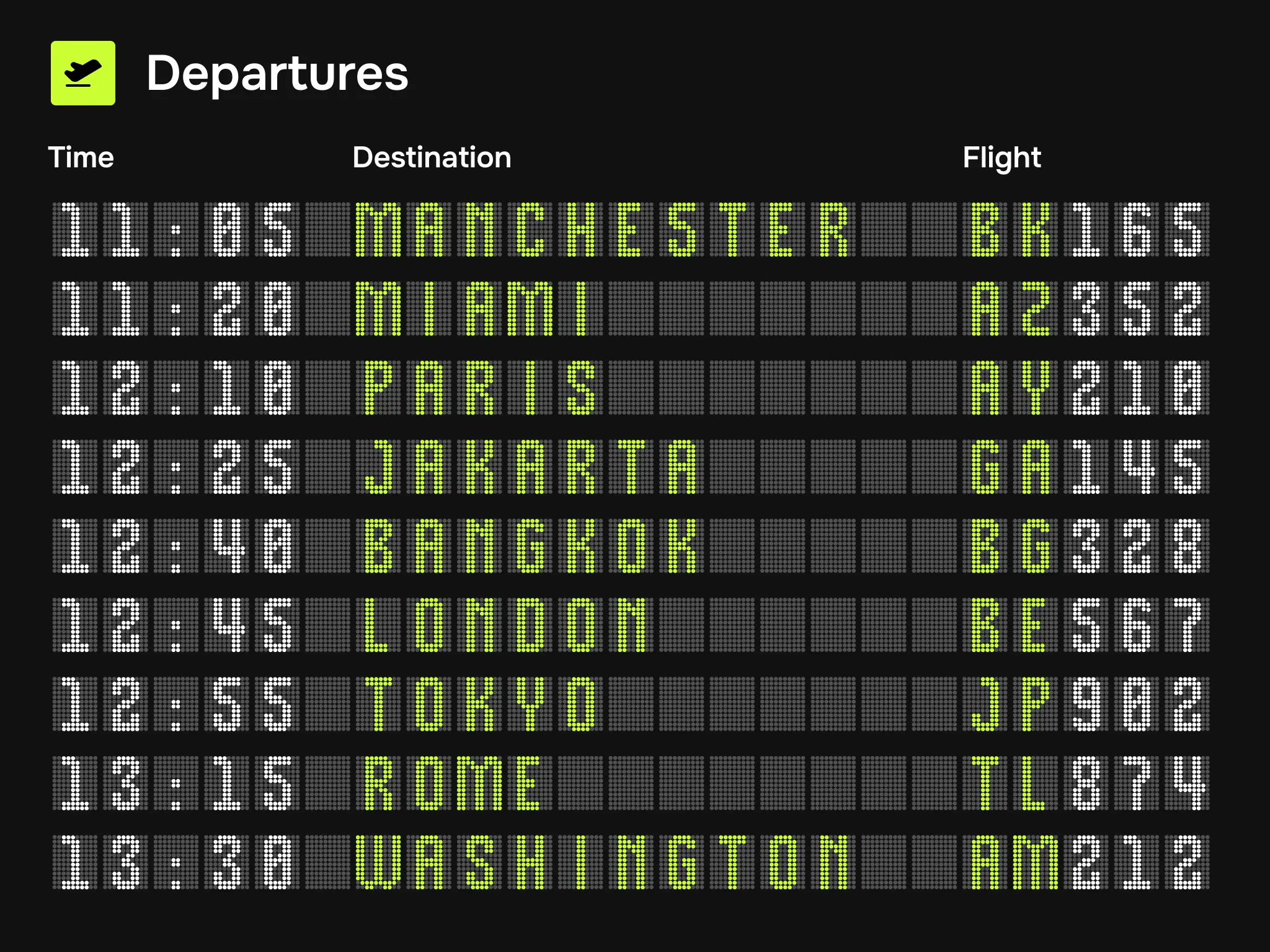
As a result, the font remains legible across many sizes. It performs well on high-density mobile screens as well as on large airport departure boards. Therefore, Alodots delivers a technical visual style that feels both nostalgic and futuristic.
Design Foundation and Grid Geometry
Alodots relies on a consistent dot-to-space ratio. This balance prevents the negative space from collapsing when the font is used at smaller sizes.
Unlike traditional pixel fonts, the design avoids square blocks. Instead, Alodots uses rounded dots that resemble real LED lights, giving the typeface a more authentic digital appearance.
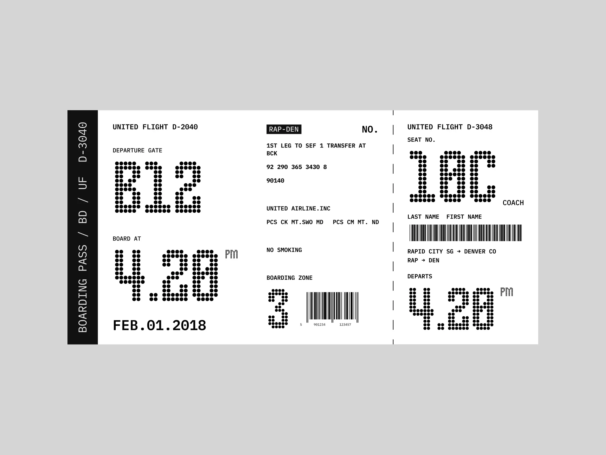
In addition, the uppercase letters and numerals use tabular spacing. This system keeps numbers perfectly aligned in structured layouts. For example, flight schedules, data dashboards, and tracking widgets benefit from this precision.
Overall, the geometry remains clean and mathematical, prioritizing clarity and functionality over decorative elements.
Functional Applications in Modern UI
Alodots works best in information-dense interfaces where hierarchy and instant recognition are essential.
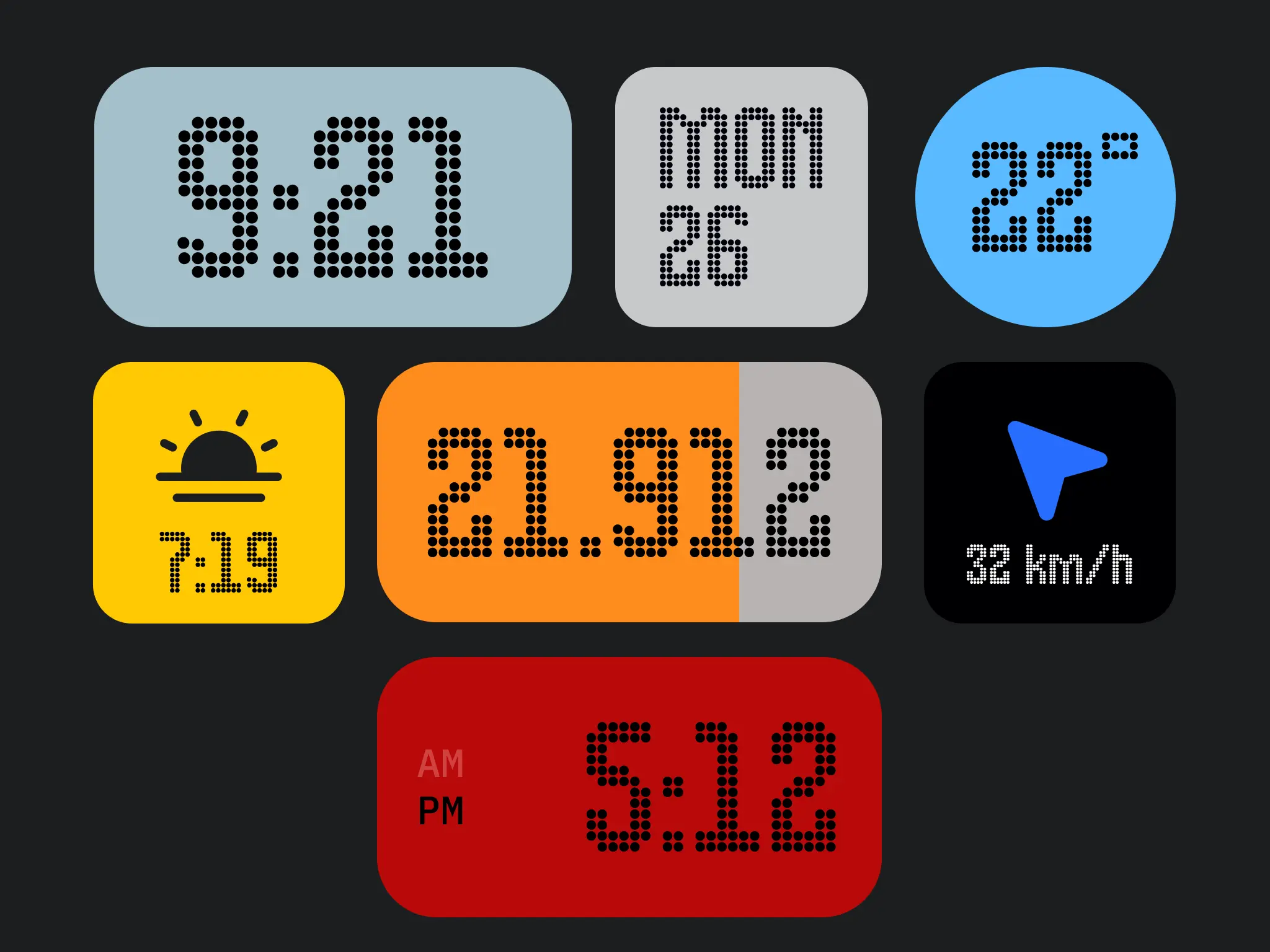
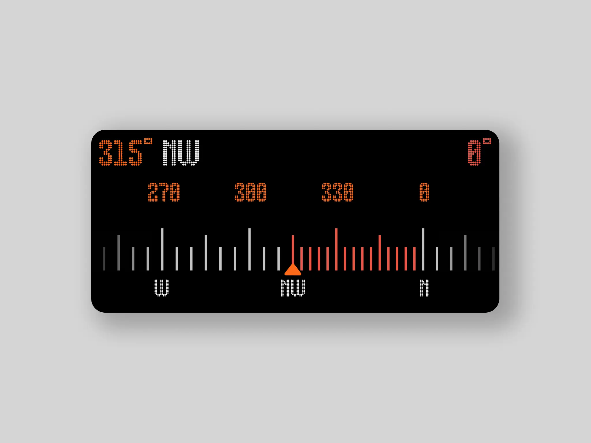
For example, mobile interfaces can use Alodots for weather widgets, fitness trackers, and system indicators. Sports designers can also apply the typeface to player numbers, scoreboard graphics, and live broadcast overlays.
Moreover, Alodots pairs well with technical sans-serif fonts. When combined with IBM Plex Mono, the result creates a balanced visual system. The dot-matrix style adds character, while the monospaced font maintains clarity for longer content.
Finally, the high contrast of the dot structure makes Alodots highly effective for dark-mode interfaces and digital billboards.
Technical Strength and Character Coverage
Beyond its visual character, Alodots includes a comprehensive set of symbols, punctuation marks, and mathematical operators designed for complex data visualization.
The character set supports multiple languages, ensuring global usability for international transit systems and multi-region software interfaces.
It also includes specialized glyphs such as temperature indicators, percentage symbols, and directional arrows. These elements are essential for navigation systems, monitoring dashboards, and real-time information displays.
The spacing has been carefully optimized to prevent optical crowding, which is a common issue in modular dot-based typefaces.
This technical precision aligns with principles promoted by The International Society of Typographic Designers, which emphasize clarity and functionality in communication design.
Professional Context and Global Versatility
Alodots bridges the gap between hardware-inspired retro-futurism and contemporary minimalist design.
Its application extends beyond digital interfaces into print media, where it can be used for experimental editorial layouts, event tickets, and technical manuals.
Because it mimics the output of legacy thermal printers and modern LED displays, the typeface carries an inherent sense of real-time data.
For this reason, Alodots is a strong choice for projects that require the visual language of live information, precision engineering, or industrial automation.
Designed By
© TypeBerka - Font Studio
Need help or more information about font you need?