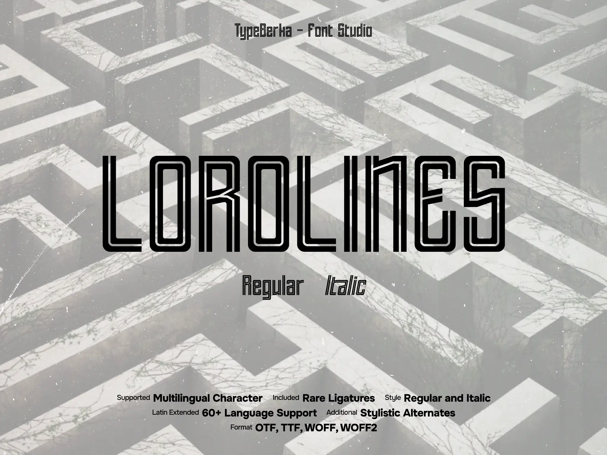
Lorolines
Lorolines is an outline display font with tall proportions and multi-line strokes that read clean at large sizes. It supports sporty, urban, and editorial layouts that need a structured, modern edge.
Included Formats
TTF, OTF, WOFF, WOFF2
Version
Lifetime updates included. You'll be notified when a new version is available.
Font Features
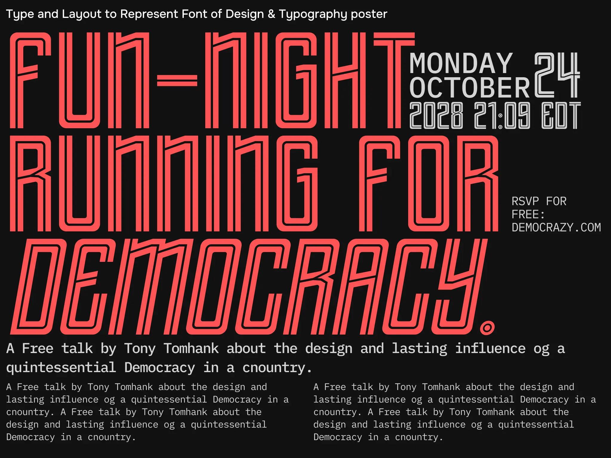
Inline display lettering for modern sport and event graphics
Lorolines is an outline display font designed for headline typography where clarity and character must work together. Its narrow proportions and vertical emphasis create strong rhythm in posters, social graphics, and apparel layouts.
The condensed structure helps designers build high-impact compositions while keeping text readable and visually consistent.
Design Foundation
Lorolines uses a condensed skeleton with open counters and a consistent inline outline construction. This system creates a structured channel effect that defines each letter clearly.
Rounded inner corners keep curves smooth and controlled. Straight terminals and simplified joins maintain sharpness across the entire character set.
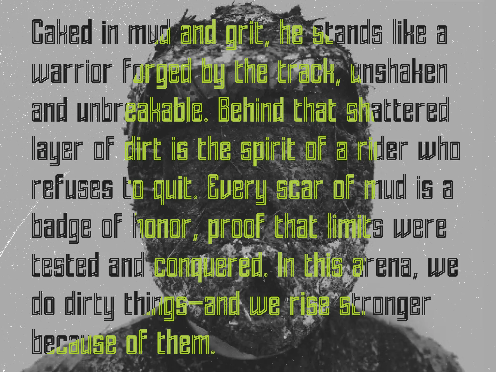
The Italic style introduces forward motion without breaking the geometry. As a result, the font remains stable even in tight tracking or stacked headline layouts.
Functional Applications
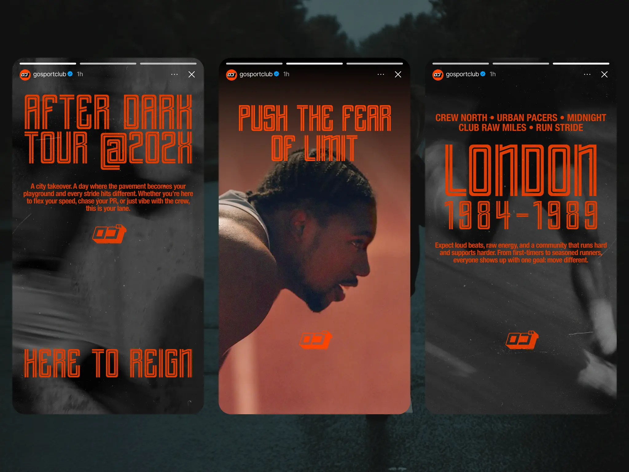
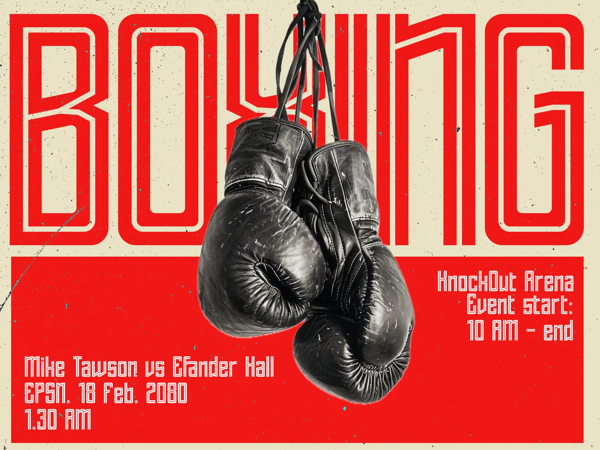
Lorolines works well for sport branding, boxing posters, race graphics, and high-energy campaign headlines. The outline structure performs especially well on dark backgrounds and neon color palettes.
Designers can also use it in layered compositions where strong impact is needed without heavy fills. In UI layouts, the narrow width helps fit labels and navigation elements while maintaining a bold visual presence.
Technical Strength
The family includes Regular and Italic styles, making it easy to create contrast between headings and supporting text.
Lorolines supports multilingual Latin characters, including Latin Extended. This allows designers to build consistent international campaigns.
Ligatures improve letter connections in tight wordmarks, while the symbol set adds flexibility for posters, editorial layouts, and interface-style graphics.
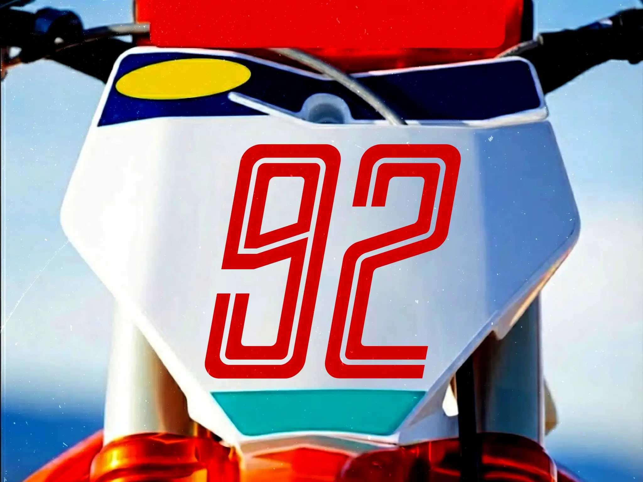
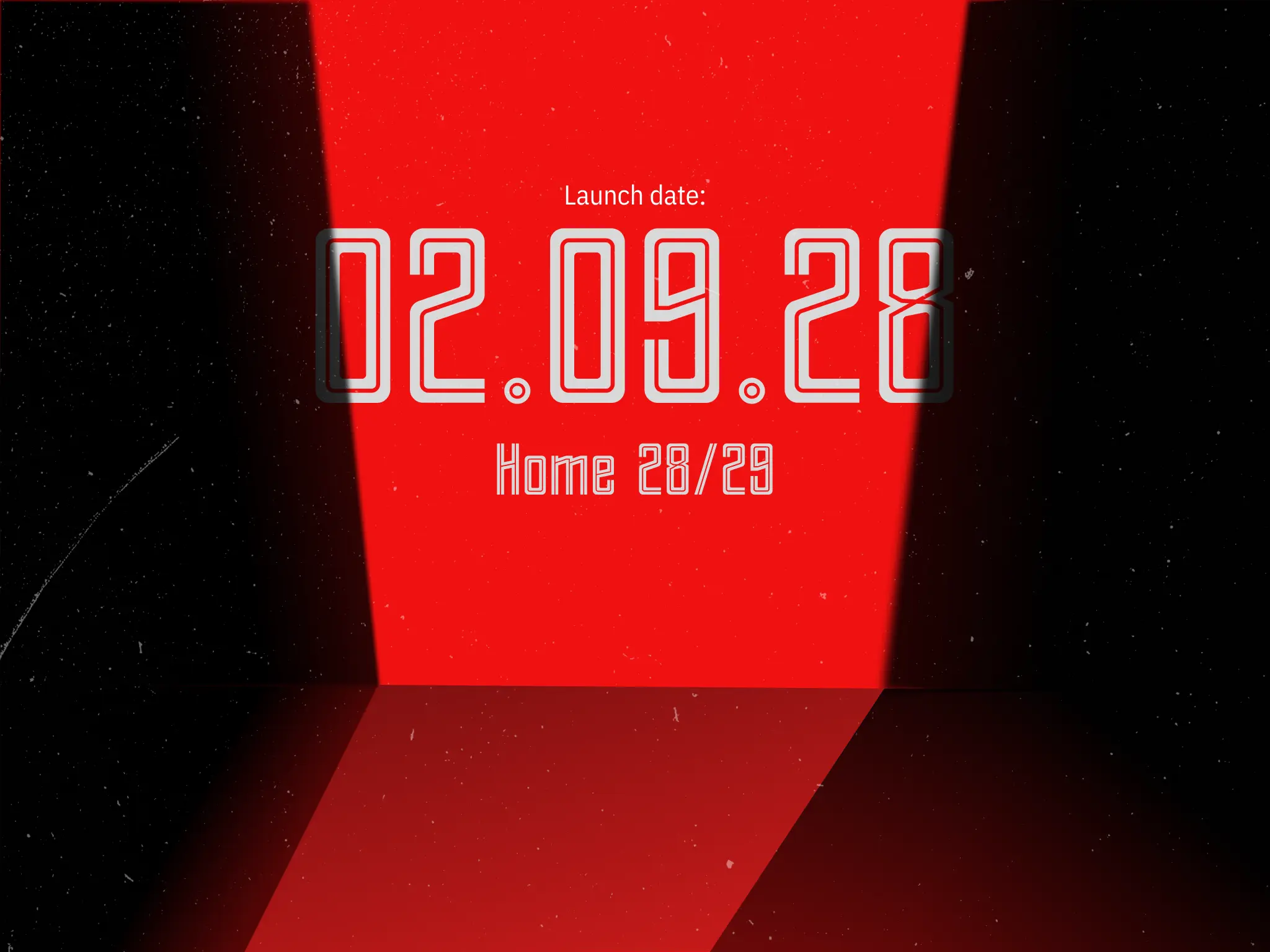
The numerals follow the same inline logic as the letters. Dates, scores, and jersey-style numbers remain visually consistent across layouts.
Professional Typographic Control
Lorolines performs best as a display system. Designers should use larger sizes, control spacing carefully, and activate OpenType features when available.
For a deeper understanding of OpenType features in modern typography, see Microsoft OpenType documentation.
Designed By
© TypeBerka - Font Studio
Need help or more information about font you need?